CLICK HERE TO VIEW MY PREZI!
http://prezi.com/el2e6xfzei-b/?utm_campaign=share&utm_medium=copy&rc=ex0share
Monday 9 January 2017
Thursday 5 January 2017
Evaluation question 2 script - Neve walder
How effective is the combination of your main product and your ancillary tasks?
For our main task we were asked to create a 5 minute short film of our choice, we also created film posters individually. Posters are key in drawing the target audience in and to make them watch the film. The poster enables them to see if the film is something they would be interested in therefore the poster must convey meaning to the target audience. I think our short film and posters work well together to create a similar meaning yet create mystery, i think they work well together because all of our posters were made to a high standard however we still followed the conventions of film posters as well as being creative in what we made and the meaning we were creating in the audience. Its important to use a house style in all your products because this gives your work identity and people see that style and immediately know who it belongs to. All the products must work in cohesion for the audience to be interested in it. i believe that the film poster is the most important product that will sell our film, this is because its the first product that the audience will see so it needs to be interesting, gripping yet professional. Secondly The review is very important in selling our product because if the review was bad then we would loose viewers, however as the target audience of little white lies is very different to the target audience of our short film its likely that the review may not reach our target audience.
My film poster: And the meaning it communicates.
The setting-the setting looks calm and relaxed as it is shot on the edge of beachy head. it is a very scenic view which would suggest to the target audience that it could be a light hearted film rather than a dramatic one. All along throughout making my poster ive wanted to create mystery by not showing to much of the genre. for example the picture i used looks calm when in the context its not calm at all and it provokes a lot of emotions for the viewer. I chose a title that looks like footprints walking over it to suggest that there is some kind of search for something or someone. The title is also very bold this captures attentions and as its big suggests drama. there are a few conventions used that help at marketing short films that are used on the poster for example:
The review is very different to our poster as in it could affect our film badly. if Little white lies gave our film a bad review the target audience would be deterred from it. However the target audience for little white lies (25-35) is very different and its likely only the end scale of our target audience that see the review however this could still affect our views if word of mouth was bad as well.
Little white lies have constructed there magazine to target a very specific type of person that is in the industry or knows a lot about it. The images used and the lexis they use also suggest this specific audience. Little white lies use a chatty fun tone when reviewing there films however the language is complex at times and wouldn't appeal to a young audience wanting a quick read.
The type of language they tend to use:
For our main task we were asked to create a 5 minute short film of our choice, we also created film posters individually. Posters are key in drawing the target audience in and to make them watch the film. The poster enables them to see if the film is something they would be interested in therefore the poster must convey meaning to the target audience. I think our short film and posters work well together to create a similar meaning yet create mystery, i think they work well together because all of our posters were made to a high standard however we still followed the conventions of film posters as well as being creative in what we made and the meaning we were creating in the audience. Its important to use a house style in all your products because this gives your work identity and people see that style and immediately know who it belongs to. All the products must work in cohesion for the audience to be interested in it. i believe that the film poster is the most important product that will sell our film, this is because its the first product that the audience will see so it needs to be interesting, gripping yet professional. Secondly The review is very important in selling our product because if the review was bad then we would loose viewers, however as the target audience of little white lies is very different to the target audience of our short film its likely that the review may not reach our target audience.
My film poster: And the meaning it communicates.
The setting-the setting looks calm and relaxed as it is shot on the edge of beachy head. it is a very scenic view which would suggest to the target audience that it could be a light hearted film rather than a dramatic one. All along throughout making my poster ive wanted to create mystery by not showing to much of the genre. for example the picture i used looks calm when in the context its not calm at all and it provokes a lot of emotions for the viewer. I chose a title that looks like footprints walking over it to suggest that there is some kind of search for something or someone. The title is also very bold this captures attentions and as its big suggests drama. there are a few conventions used that help at marketing short films that are used on the poster for example:
- Social media icons- if the product is put on social media or people can follow our production group it will advertise our product and get shared over facebook or twitter.
- Large titles grab peoples attention from afar.
- Awards show that others like the film.
- Reviews also show that people have viewed and like our film.
The review is very different to our poster as in it could affect our film badly. if Little white lies gave our film a bad review the target audience would be deterred from it. However the target audience for little white lies (25-35) is very different and its likely only the end scale of our target audience that see the review however this could still affect our views if word of mouth was bad as well.
Little white lies have constructed there magazine to target a very specific type of person that is in the industry or knows a lot about it. The images used and the lexis they use also suggest this specific audience. Little white lies use a chatty fun tone when reviewing there films however the language is complex at times and wouldn't appeal to a young audience wanting a quick read.
The type of language they tend to use:
- Complex nouns
- Metaphors
- complex sentences
- Restricted code in language
- Rhetorical questions
- Puns
- adverbs
- adjectives
- similes
When writing our review we made sure to make our language as similar as possible and still create an interesting review that would help sell our film in synergy with the poster.
Wednesday 4 January 2017
Harry McHale - Evaluation
Question 1 - In what way does your media product use, develop or challenge forms and conventions of real media products?
PRE-PRODUCTION: ANALYSIS OF EXISTING SHORT FILMS
During the pre-production stages of our product, we were set various tasks in order to contribute to the research and planning of our film. One of the tasks set required us to individually watch 4 different short films and make a analysis on how these short films are constructed, using elements of MRANG in our analysis.
- Media Language
- Representation
- Audience
- Narritve
- Genre
Throughout this task I notice a variation of narratives which incorporated a wide range of techniques/features which helped me think of ideas for our short film. This task also helped me define what makes a film, a short film. Various features of short films I have noticed include:
- 3 - 15 minutes in length
- Very few main characters, rarely any secondary characters due to the short amount of time they have to establish characters to the audience compared to feature length film
- Short films are published by independent film companies
- Short films can be found in almost any genre you can find a feature length film in
- Short films represent the majority in the social-realism genre.
- The basic narrative of a short film usually has a protagonist needing to solve a situation
- The actors are never big names due to low budget of short films; the actors are never advertised in big bold letters on the short film posters
The 4 short films I researched aid my thought process on how I would construct our short film. The plot of our short film is a combination of ideas generated from viewing other short films by either doing things differently to the real media products; or something similarly.
SHORT FILM 1: 'THE SWITCH'

'The Switch' is an adventure short film directed by Rigan Ledwidge and unlike most short films, has a large budget as it is backed by sporting company Nike however the film lasts 6 minutes which means it is still a short film; making a good film for analysis as I can learn from the techniques that are used in this short film. This film contains features from well renowned football stars including Cristiano Ronaldo (the most popular footballer on social-media) this film is too long and nearly impossible to cut-down for TV promo.
Cribbing the well-known sci-fi concept of “body-switching”,
international superstar Cristiano Ronaldo collides with a young British fan in
the stands and is startled to find himself waking up in a rundown flat. Equally
surprised however is the 16 year old Charlie, who wakes to the impressive
trappings of Ronaldo’s lifestyle: a mansion, beautiful assistants, and exotic
sports-cars.
 The short film starts with a very short extreme long-shot
establishing the scene which appears to be Wembley stadium. From this
establishing shot we can make out this is a football match between England and
Portugal where a corner is being taken as the box is filled with attackers and
defenders. A close up to an English player moving towards the goal and the
diegetic voice-over of the commentator stating it's 'corner' but then we cut to
a medium high angle shot where we can see a Portuguese player clearing the ball
from their goal and the commentator saying 'Portugal clear'. We then see
various shots of Portugal on the counter or more specifically Ronaldo (one of
the main protagonists) running down the wing via fast paced cuts.
The short film starts with a very short extreme long-shot
establishing the scene which appears to be Wembley stadium. From this
establishing shot we can make out this is a football match between England and
Portugal where a corner is being taken as the box is filled with attackers and
defenders. A close up to an English player moving towards the goal and the
diegetic voice-over of the commentator stating it's 'corner' but then we cut to
a medium high angle shot where we can see a Portuguese player clearing the ball
from their goal and the commentator saying 'Portugal clear'. We then see
various shots of Portugal on the counter or more specifically Ronaldo (one of
the main protagonists) running down the wing via fast paced cuts. In terms of Tvetzan Todorov's narrative theory, this is the
equilibrium as everything appears to be normal. Then there's a change in mood
as Ronaldo trips over the advert billboard and hits an England fan. A light
non-diegetic ringing sound is played as both Ronaldo and the young England fan
Charlie Lee are seen with their hands on their heads as if they have a
concussion or another head injury. This is the disruption to the equilibrium in
terms of Todorov's narrative theory.
In terms of Tvetzan Todorov's narrative theory, this is the
equilibrium as everything appears to be normal. Then there's a change in mood
as Ronaldo trips over the advert billboard and hits an England fan. A light
non-diegetic ringing sound is played as both Ronaldo and the young England fan
Charlie Lee are seen with their hands on their heads as if they have a
concussion or another head injury. This is the disruption to the equilibrium in
terms of Todorov's narrative theory.
 A sound bridge into an alarm ringing brings us into the next
scene as the previous scene transitions via a fade to black. We see Ronaldo
wake up via a close-up but through his facial expression the audience can make
out that something is wrong. This helps emphasise the disruption to the
equilibrium in the narrative. In contrast, we get a close up of Charlie also
waking up, we cut to a POV shot to a poster of Ronaldo and back to Charlie's
facial expression which also implies shock. We see both protagonists explore
their setting; there body language and facial expression shows they are
confused - The camera tracks Charlie as he runs to the bedroom window to see he
is living in a terraced flat. Ronaldo looks through his window to see his more
vibrant place compared to Charlie. He turns around to the mirror in which his
face is immediately shocked. We cut to a low angle extreme long-shot of
Ronaldo's residence with the sound of him screaming. The screaming carries on
via a sound bridge to a long-shot of Charlie's neighbourhood as we also hear
him scream. At this point the audience are aware that the two men have switch
bodies. This is confirmed when we cut to a medium shot of Charlie when we hear
diegetic dialogue from him saying "I’m a kid?" in a questioning way.
His accent suggests he is from London but he is speaking in Portuguese which
also seems unusual. This helps explain why Ronaldo is confused as he hasn't
said any dialogue yet.
A sound bridge into an alarm ringing brings us into the next
scene as the previous scene transitions via a fade to black. We see Ronaldo
wake up via a close-up but through his facial expression the audience can make
out that something is wrong. This helps emphasise the disruption to the
equilibrium in the narrative. In contrast, we get a close up of Charlie also
waking up, we cut to a POV shot to a poster of Ronaldo and back to Charlie's
facial expression which also implies shock. We see both protagonists explore
their setting; there body language and facial expression shows they are
confused - The camera tracks Charlie as he runs to the bedroom window to see he
is living in a terraced flat. Ronaldo looks through his window to see his more
vibrant place compared to Charlie. He turns around to the mirror in which his
face is immediately shocked. We cut to a low angle extreme long-shot of
Ronaldo's residence with the sound of him screaming. The screaming carries on
via a sound bridge to a long-shot of Charlie's neighbourhood as we also hear
him scream. At this point the audience are aware that the two men have switch
bodies. This is confirmed when we cut to a medium shot of Charlie when we hear
diegetic dialogue from him saying "I’m a kid?" in a questioning way.
His accent suggests he is from London but he is speaking in Portuguese which
also seems unusual. This helps explain why Ronaldo is confused as he hasn't
said any dialogue yet. After the title sequence plays, we hear non-diegetic music which makes the situation less comedic and more serious. We carry on to cross-cut between the men in there new bodies. We hear charlie's mum call for him as he rushes down the stairs and we hear a diegetic voice calling for Ronaldo. Ronaldo as Charlie asks Charlie's family what he is doing here and 'who are you' in Portuguese. Charlie's mum responds with diegetic dialouge 'oh dear me, looking who's being taking Chinese.' When (supposively) Charlie responds with "I'm Cristiano Ronaldo." Much to this disappointment, Charlie is laughed at by his family who think he has lost the plot.
As we continue to cross-cut between the two protagonists, we immediately see a representation in the difference of social class of the two characters. Charlie is taken to school by his mum in a old Volkswagen Polo whereas Ronaldo is given his keys by his assistance to his McClaren P1. Charlie (In Ronaldo's body) is going to football training with professional footballers whereas Ronaldo (In Charlie's body) is going to the school playground to play amateur football.

 Despite being in different bodies, there characteristics are still the same. The comedic value of this is the other characters are unaware of the body switch whereas we the audience are aware. This creates dramatic irony as we know more than the characters. The other Portuguese footballers are very confused as they see Ronaldo playing poorly when it's actually an amateur footballer trying to play like Ronaldo. The opposite is predictably happening as we cut to a playground as we Charlie's friends in complete awe as they see Charlie performing advance football skills including the 'Ronaldo Chop' ironically. The jokes continue as we see Charlie at a training ground, when he approaches a freekick the oppositions wall joke about his stance by saying "Who'd you think you are; Cristiano Ronaldo?" in a mocking way as they laugh; this is shortly followed up by near goal which the opposition stop laughing and there facial expressions suggest they are shocked and impressed.
 Otherwise, We see Charlie struggling as Ronaldo. To mix with this the commentator states via a digetic voice-over 'Ronaldo gives it away cheaply' which further emphasises Charlie's new struggles as pretending to be one of the world's best footballers. We cut to the next scene where we see from Ronaldo's facial expression and body language that he is frustrated as he keeps training. This shows a change in attitude as he keeps wanting to thrive otherwise he will be founded out as an impostor if he doesn't. We can also see it from the Ronaldo's teammates facial expressions that they are puzzled by Ronaldo's drop in form and one of his teammate's body language connotes that as well as we see him pointing at Ronaldo constantly training hard.
We then cut to Ronaldo as Charlie who is also training harder than usual as his freinds look at him in a strange way when he goes out on a run after football. This is when we cut to a timelapse of Charlie going up the ranks of football league from non-league to playing in the top flight for Manchester City. This represents the differences in social class of Charlie and Ronaldo as charlie has to go playing from the streets to reach his goal whereas Ronaldo wins awards despite not playing very well. In terms of Todorov's narrative theory, this is the start of trying to repair the damage caused from the disruption of the equilibrium as both Ronaldo and Charlie try and reach top level so they come in contact with each other.


The non diegetic soundtrack becomes more lively and brings out a positive feeling: this could foreshadow a new equilibrium in terms of Todorov's theory. We cut to similar looking scene, a football match between Portugal and England. We see evidence of Charlie Lee's meteoric rise in football as he is seen playing for england. In the tunnel as the player's wait to go onto the pitch, Ronaldo turns around and see's his original self which instantly takes him by surprise as seen by his facial expression; Charlie doesn't seem too bothered but does give his original self eye contact.
The football match proceeds and Portgual are on the attack. Ronaldo performs lots of advanced skills which show how much training he has put in to regain his form. He crosses the ball and Andre Gomes scores the goal - the commentator then shouts 'scored by Gomes, made by Ronaldo.' We cut to an england attack where this time, Charlie sets up Harry Kane to score; this shows that despite being in different bodies, Charlie has made it to the top level with Ronaldo's football intelligence and Ronaldo has re-gained form via Charlie using his Ronaldo's physique to help him.


After various cuts of intense football action, we cut to the two protagonists run towards each other as they go for the ball. The non-diegetic soundtracks has a crescendo to it as the music builds-up and the cheerfulness of it is gone. The action is intense as the facial expressions of the spectators feel that there may be a horrible clash between the protagonists. The same diegetic beeping sound that was played when the protagonists clashed with each other is played again. The game is stopped as the two players regain conciousness. It's immediately obvious through there body language that the two have swtiched bodies. Ronaldo picks up Charlie and in terms of Tvetzan Todorov's theory; a new equilibrium is created. The characters never known the two have switched apart from the protagonists themselves. This creates dramatic irony for the spectator as we known what has happened this whole time.
SHORT FILM 2: 'AMBITION'
This short film also has a chronoligical narrative like 'The Switch' therefore it uses elements of Todorov's narrative theory. The difference between this short film and 'The Switch' is the budget of this short film is what you'd normally expect of a short film as it appears to be low budget; another difference is the genre of this film which aims for a more social-realism feel to it. Many short films implement elements of social-realism which is why we used conventions of social-realism genre in our short film.
The short film is about a six year old boy named Thomas. Thomas has an ambition, an ambition to save up his pennies to buy himself a toy from his favourite toy shop. This short film follows Thomas' journey from the point he fills his piggy bank but the protagonist is confronted with a dilemma and has a big decision to make at the end of the short film.
The short film begins with a high angle medium long shot of what appears to be a family coming out of there house on mild day. In terms of mise en scene, the costumes of most the characters suggests they are going out on a family outing. One of the charcters, 'Thomas', a young boy, is wearing blue jeans and a green rain coat; this indicates that this is set on the weekend as he's not in school uniform which is what you would expect a young boy like Thomas to wear on weekdays.
As a spectator, we assume that this family outing is probably something along the lines of going to town or going for a walk somewhere. The lighting seems to have manipulated in editing in order create a positive mood: a calm tranquil non-diegetic sound helps emphasise this. The shot pans down and zooms into a close-up of a penny; the spectator will question the importance of this penny and what it foreshadows in terms of plot or narrative. As Thomas picks up the penny and the camera pans back up to his face, the title appears onscreen in a soft, simple font, suggesting the film to follow a similar trait; adopting a possible convention of the genre type.

A close up of Thomas in his room placing the penny in his piggy bank connotes a beginning to the plot of this short film; this leaves the spectator wondering where this short film will take us. The title of this movie 'Ambition' implies that the boy has something he wants to save up to; a 'ambition'. This links to a generic representation of social realism in Britain as it is common for children to want to save money in order to get something they want; the audience can most likely relate to this therefore making the short film more enjoyable as it brings a sense of nostalgia.

As the film progresses, Thomas finds himself earning extra money from other sources such as finding pennies down the back of his parent's car seats as well as doing chores around the house which he gets 'pocket money' for, for example, a long shot of Thomas cleaning the what appears to be living room with a vacuum whilst his dog sits out of the way on a chair.
Thomas' activites contradict the stereotype of children that is all they want to do is play around, no child wants to do household chores. However, this also shows a child's determination to get something they want; the audience will most likey be able to relate to this which creates a special connection between the audience and the film.

At various points in the film, various shots (mostly close-ups) of Thomas' piggy bank keep us, the spectators, on track with Thomas' progress towards his goal; his 'ambition'.
We then see Thomas walk up the bucket before a close up shot shows us the money falling into the bucket as he attempts to fix the disruption in the equilibrium. It's this close up of the money falling into the bucket which really places the emphasis of the boys ambition. For ages he had wanted to save up for the toy, yet in the end it wasn't worth it and he figured that it should go to a good cause, making the audience sympathise. Thomas then turns back to his mum with a smile on his face; indicating a new equilibrium has been created. The scene fades the black and the credits role up, indicating the end of the film.
What I like about this film is the nostalgia of it and how well it connects with the audience with elements of nostalgia. The audience really focus on the story which despite the dilemna, the story has a happy ending and has a moral story behind it. I also like how the title of this film works really well with the narrative of the film. In the production stages of our product we aimed to make sure our film connects to our audience in a emotional way.
OUR FINISHED PRODUCT: 'ON THE BRINK'
Our short film attempts to follow key features of short
films, but in places, challenges and develops them. We ensured that it mirrored
these key features:
- Duration: our short film was just above 5 minutes - similar to 'The Switch' and 'Ambition'.
- Narrative: our short film has a chronological linear narrative and is supported by Tzvetan Todorov's equilibrium theory; similar to 'The Switch' and 'Ambition'.
- Realistic - throughout our short film, it follows the conventions of the social-realism genre.
However it challenged these key features:
- Minimal characters - our short film contains 6 characters which is much more than you would see normally in a short film.
- Voice over - the narrative is told by following the protagonist's journey: not through a voice over unlike various other short films.
9 FRAME ANALYSIS: 'ON THE BRINK'

 Frame 1: Our short film starts with a blurred shot of the sky with the production company logo on top. we cut to a low angled shot of a door with the title 'on the brink' in bold white capital letters covering the middle of the shot. We anticipate two characters coming as the diegetic sound of footsteps becomes clear. The title disappears as we see two characters walking in front of it towards the door. The lighting suggests it is early evening with indoor lighting imply that there's a group of people inside. It cuts to an eye-level medium close-up of the door opening and revealing two other characters greeting the ones at the door. We learn through diegetic dialogue of the characters relations with one another and find out that the daughter hasn't seen her parents in a while. We follow the characters into a dining room where the protagonist introduces her boyfriend to her brothers. In terms of Tvetzan Todorov's narrative theory; this film indicates a sense of equilibrium however the audience will know that this will not last and will question when the equilibrium will be disrupted.

 Frame 4: The contrast between John and the family becomes more apparent after John leaves the bathroom and struggles to get downstairs. We see him turn over to focus onto his family; we can not see the family very well as they are blurred out via shallow depth of field but we can hear laughter and conversation (in a happy mood). John turns around with a displeased facial expression and goes off. As time passes the family when made aware of John missing don't seem to be to concerned as one of them mentions that he does this quite regularly but returns in the end. This makes the audience ask even more questions on what John is doing.
 Frame 5: In the initial church scene, there is only one shot of John in the church. The shot is long in terms of duration and despite not a lot happening; the audience can learn about John through his body language in this scene. The shot is a medium angle extreme long shot and this creates dramatic irony for the audience because unlike the family who are desperate to find John; the audience already know where he is. This shot is very effective as the lack of dialogue allows the audience to interpret this scene in many ways.


 Frame 9: This shot is one of the last ones in the film. A lot has been building up to this moment therefore there is still a lot of anticipation and elements of restricted narration as there are multiple possible outcomes to the end of this film. We follow Rebecca as she approaches John in a hurried fashion screaming out his name. The use of shallow depth of field emphasises the distance between Rebecca and John physically. The intensity of the non-diegetic soundtrack is raised via a crescendo which continues to become more intense as Rebecca gets closer to John. We end the film on a cliffhanger (no pun intended) as the we leave the audience wondering if John decided to carry on with his life or if he jumped.
FILM POSTERS: 'REAL MEDIA PRODUCTS'
The film poster promotes the film and attracts the target
audience, therefore it's an important factor in advertising the film. Film
posters have certain conventions that have to be followed in order to create a
successful one. These conventions include:
- Name of the starring actors
- Pictures of the starring actors in/out of character
- One main image usually from the film
- References to other films
- Cultural references and taglines
- Website
- Critics praise for the film
- Rating system
- Billing block
- Age certification
- Release date
- Main title

This poster is a visual representation of life in Moldova during civil unrest. The battered shoe abandonded represents the people fleeing from the corrupt government and the runaway implies this as well.
The lack of characters makes the audience asks questions. It makes them wonder who is the owner of the shoe and what happened to him/her. This is a strange and unique technique as the majority of posters I have looked at (short film and feature length) have the protagonist(s) and some also have the antagonist(s) as well on the poster. This already gives the film poster a USP. It's important to make your poster to stand out therefore I implemented a unique design in my poster.
The poster has various conventions of film posters such as a bold title, credit block a tagline etc. However this poster contains elements that I have not used in my final poster such as actor's names, listing of the director, certification and a tagline. Whilst some short film posters have a tagline the other features listed are often found in feature length films instead of independant short films; especially foreign films that aren't as popular.
A also analysed a higher budget feature length film in order to compare the difference in terms of content and style between a low budget poster and a high budget:

From first viewing this film poster, a lot can be determined in terms of target audience as well as genre of the film. Firstly due to the fact that the poster shows a young teenage boy overlaid onto a dark black and grey background (colour), suggests that the film is probably aimed at audiences that are 17 and over, and with the likelihood that it is aimed more towards the male population instead of the female population. This could be connoted from the typography of the word 'illegal', bringing in stereotypical connotations that the person doing the illegal activity is the boy on the poster. This could be backed up further from the way the boy is in the centre of a long shot, with a bright light from the background emphasising the fact that he is the main character in the film.
Looking deeper into the poster, a lot is revealed from the background images. Most notably the graffiti sprayed onto the garages and walls of the alley. This instantly tells the audience that the film is mainly about crime as well as the fact that the boy could be from a working class background. Now looking further at the boy's clothing (costume), a lot of stereotypical judgements can be made of the boy. Firstly because of the way he is wearing tracksuit bottoms, a hoody and a baseball cap, the audience assumes that the boy is from a minority background, this is also backed up from the way the boy's skin colour suggests that he could be from a ethnic minority background.
The bag that he is holding also suggests to the audience that that is his equipment used when carrying out the 'illegal activity', hinting at possible theft. Finally when looking at the typography at the top of the poster (knowledge is power) the audience recognises that the boy obviously knows something that only few people know and so when it comes to doing the 'illegal activity', he gains some sort of power from it, either from friends or family.
This poster contains elements that you would expect from a film poster. Some elements that aren't apparent from the feature length film poster including the avoidance of using actor's names. Most feature length films have their short films in massive bold lettering. The typrography of the main title is intriging: unique typography is an element I implemented in my final poster.
FILM POSTERS: 'OUR SHORT FILM: ON THE BRINK'


Our four posters main purpose is to generate interest into the film. Whilst many of our posters share similar elements such as a large, bold title; many have elements that differ from one another such as elements in my poster:

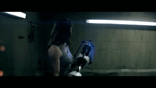
The poster design is based around a screenshot from our short film of a extreme close up of the protagonist. The facial expression doesn't suggest anything that would spoil the film as such. He has a subtle look which means the audience could foreshadow that he is concealing or hiding something like he is in the actual film.
The other half of his face is partially hidden which creates enigma but also makes the poster eye-catching and stand out which is equally as important as film posters are used as a form of advertisement. The typography has a almost stair like effect in terms of alignment with the 'b' in brink having a diagonal cut through it. This represents the edge of the cliff which he stands on in our film.
The poster is done in grey-scale as this is used in various posters that want to give off a mysterious vibe. The lack of colour is another way of making the poster stand out.
Conventions of short film posters are included here such as the awards and nominations from film festivals that support/raise awareness. One of the changes in the final version was making the festival awards and nominations smaller as most short film posters are more focused on the poster art rather than the advertisement of film posters. Various details at the bottom of the poster were made smaller in the final version as these are not important for our target audience.
Reviews were added to the top to attract people to see the film. I didn't use star reviews as I felt this is more common in feature length film posters and I wanted to create a poster which was distinct from generic film posters.
One the aspects which had positive feedback on is the poster's clever design however a point to consider is that the poster doesn't reveal a lot of about the film and from an initial analysis: I will keep it like this as it creates enigma and makes the spectator have to guess what could happen in the short film.
LITTLE WHITE LIES: 'REVIEW'

Little white lies is a independent movie/film magazine that's published every other month by The Church of London.

The magazine features a variety of things that appeal to their target demographic. It includes features such as:
- Film reviews
- Adverts
- Interviews
- Photography/Illustrations
It's split into six chapters: the lead review, an a editorial introduction, a series of articles inspired by the feature film, theatrical reviews, the back section and future releases.
The magazine ensures that the content appeals to their target audience, therefore they carefully consider what features in their magazine. Statistics from 2008 show that the magazine is popular wiht people aged from 25-35 (51%) that work in the media industry (22%) and are mostly male (63%). It's clear that Little White Lies have constructed their magazine to appeal to these people.
The people reading this magazine will have an interest in
films and critics and will have their own opinion on their favourite films.
Statistics from 2008 show that most people hardly went to the cinema, (72%), to
see films due to the popularity with DVD's at the time which was before online
streaming. The statistics also show that 93% of readers read the magazine from
cover to cover and kept their copies after reading them.
Some of the adverts appeal to the male demographic due to
advertisements for beer and other male specified things. However, not all the
adverts are targeted for males, some of them suggest that the magazine are
targeting well-educated people of both sexes that are high class due to the
feature of advertisements such as BBC Proms which would include high
class/classical music and 1% for the Planet which would include environmental
issues that caring higher class people would be usually concerned about. The
cost of the magazine is now around £6 which also demonstrates the higher class
demographic due to the expense of the magazine which lower class people
wouldn't want to purchase because of how much it is.
In our review, we made sure to meet the conventions of the layout and style that Little White Lies use in their magazines.

SCRIPT:
When creating a short film one of the important factors to consider is marketing. There are various techniques in terms of marketing; some more effective than other however, the less effective ones can be more cost-efficient. The combination of our main product and my ancillary tasks accomplishes effective marketing of our short film.
One of the tasks I was set was to create a poster which would be
stylistic and advertise our film. The aim of this poster was to generate enigma
to attract people to our short film. Our posters have differentiation in terms
of elements but I made sure that my poster had specific elements to make it successful
and match the conventions of modern film posters. These elements include:
·
A large, bold title
·
Reviews with key words standing out (These
were added to the top to attract people to see the film.)
·
Laurel leaves for film festivals
·
Billing block low in the frame
·
Social network icons to connect with our
target audience (15 – 25 year olds)
·
Companies involved at the bottom of the poster
·
A main image with one of the main characters
The poster design is based around a screenshot from our short film
of a extreme close up of the protagonist. The facial expression doesn't suggest
anything that would spoil the film as such. He has a subtle look which means
the audience could foreshadow that he is concealing or hiding something like he
is in the actual film.
The other half of his face is partially hidden which creates
enigma but also makes the poster eye-catching and stand out which is equally as
important as film posters are used as a form of advertisement. The typography
has a almost stair like effect in terms of alignment with the 'b' in brink
having a diagonal cut through it. This represents the edge of the cliff which
he stands on in our film.
CUT
Another marketing method is using a film review to show the target
audience what others think after watching the film. The review can be good or
bad but if the review gives the film universal acclaim, the reader will be more
intrigued to watch the film. The review works in synergy with the poster to
reveal aspects of the film without giving away too much detail.
Taking into account that the review is written by the Little White
Lies Company, it's important to remember that they target a different audience;
the magazine ensures that the content appeals to their target audience,
therefore they carefully consider what features in their magazine. Demographic
statistics from 2008 show that the magazine is popular with people aged from
25-35 (51%) that work in the Media industry (22%) and are mostly male (63%).
It's clear that Little White Lies have constructed their magazine to appeal to
these people.
The language tends to be complex and chatty at the same time which
allows the review to carry undertones of seriousness but also to seem friendly
and engaging to read. Little White Lies likes to use a variety of styles when
writing in order to appeal to their target demographic. The style can vary
from:
- · Nouns/complex nouns
- · Complex sentences
- · Restricted Codes in language
- · Adverbs
- · Metaphors
- · Puns
- · Adjectives
- · Rhetorical questions
It was important to that we matched these aspects in our review.
In order to do this we made sure to meet the conventions of the layout and
style that Little White Lies uses, using advance page publishing software such
as Adobe InDesign.
Question 3 - What have your learnt from your audience feedback?
Audience feedback is vital when it comes to altering things
and changing things for the better during the editing process. We managed to
gain a stable amount of audience feedback on several aspects of our project.
Our main goal however is to gain feedback from our target demographic which is
young adults aged from 16 - 25 male and female.
We used social media sites such as Facebook and Twitter
due to the vast amount of people it would reach. We were able to study the
comments that people made and apply those changes to our short film. We also
asked people whether they liked our overall ideas for our short film using the
survey creator, 'SurveyMonkey'. We chose to use these websites as our target
demographic would be familiar with these websites as they are used often
day-to-day, and so this would give us reliable data that we can positively use
towards our film.
FEEDBACK: 'PRE-PRODUCTION IDEAS'
It was important that we'd gather audience feedback before moving into the production stage of our product. We were able to analyse the responses from the questions we asked which enabled us to develop a further understanding of the conventions of our film and make changes to our film based on feedback.
We asked 4 people these questions:
- Would you be interested in the genre (drama) and why?
- Do you like films that have a cliff hanger or not and why?
- Do you think the idea is good? Is there any improvements we could make to appeal more to your age group.
Here are the responses to the questions:
Caitlin, aged 23: "I would be interested in a drama genre because
suspense makes it interesting and keeps your attention. Yes I like cliff
hangers, but not if they're too obvious as to what is going to happen next. I
think there should be more information given on the dad’s background and why he
ended up depressed as this will make the characters more relatable to the
audience."
Connor, aged 17: "I would be interested in a drama genre because it
sounds very gripping and a well thought out story. I think a cliff hanger in a
film is good because it makes you think what happened after and keeps you
thinking. It's a good idea, but it could be made clearer on why he is depressed
and why he is so desperate to commit suicide."
Tara, aged 17: "It seems like an interesting short film and something
I think along with other teenagers would be intrigued by mostly due to the fact
that the drugs involved could perhaps be relatable in some cases however
personally I think what would be most intriguing to me is the dramatic plot.
Honestly no I would only probably like a film with a cliff hanger if I knew
there could be a second film to find out all the information. I think that
adding more information on all the characters would be good (so your audience
connects with each character more). I would also suggest focusing on the dad a
lot. An idea, maybe the daughters mother actually died a long time ago and that
was the catalyst for the father which caused the depression and eventually the
drug use."
Kellie, aged 19: "It sounds as it could be along the lines of crime
drama and anyone who knows me knows I love a good crime or mystery and I love a
bit of drama. I love films that have cliff hangers. It's like when you read a
really good book and you get to the end and there’s a huge twist and it ends on
a cliff hanger and you just want more. Cliff hangers are just exciting because
there's usually twists and things you weren't expecting and they get you all
excited wanting more of the story. The idea in itself is good. I think maybe you
could add a little more mystery in it, even if it’s the tiniest little thing.
It would appeal to my age group, but could also appeal to those older than me
because of the mystery and crime essence about it."
FEEDBACK: 'PRODUCTION'
During the production (construction) stages of our product we wanted to make sure that our film stills appeals to our key demographic.
We asked Erol, age 18, about our short film. The questions we asked would allow us to make changes on whatever didn't seem to work or could of been done better. It also furthered our understanding of how the film relates to our key demographic or how it doesn't therefore how we can make it do what we intended.
Do you think the ending is successful? How does it make you feel?
Yes, it leaves the audience in suspense and made me feel very tense.
Do you think John's motives are clear enough?
Yes, definitely. It is clearly represented throughout the film.
Did we use appropriate settings in the film?
You have chosen great locations, for example, Beachy Head as it is so iconic and sadly meaningful to the kind of message you are putting across.
Does the music reinforce the mood of the narrative?
The music is very fitting to the narrative and adds an emotional response to the situation.
Any other comments or improvements on our film?
I think the acting is really good and very genuine. I also think many people can relate to it on some levels as mental health is such a common thing.
We asked an extra 3 questions to James and Niamh. James and Niamh aren't media students: this gives us more variety in our feedback which makes our overall feedback more reliable. We used this feedback as well to make improvements on our product.
Do you understand the relationship between each character from watching the opening shots of the film?
James: "Hello darling" made it very clear what the relationship was between the daughter and father. You can tell that the daughter was more relaxed as she was with her family, however it clearly showed that the young man was her boyfriend through his handshake with the father.
Niamh: I can tell it was the mun and dad inviting in their daughter and her partner. I can tell this through their excited facial expressions and body language which expressed that it was the daughter's parents.
How effective do you think this scene (bathroom) is in portraying John as a character with immense stress and addictions?
James: The shot in the water really expressed his distress as it was very distorted. Where the tablets were hidden makes it appear that he knows what he is doing and has been hiding this addiction for a long time.
Niamh: It was effective as it engages you to understand his situation that he is in and why he is doing it. The close-up of him taking the pills emphasises his stress and addiction, generating a sympathetic response.
Does this ending build suspense effectively and leave audiences on a successful cliffhanger?
James: Yes, I feel as though this cliffhanger is very intense. I love cliffhangers as it makes you want to watch more.
Niamh: It captivates you and want to see what happens, it is almost frustrating as you want answers.
FEEDBACK: 'POST-PRODUCTION'
We wanted to have feedback on our finished short film from our class who our all in our key demographic. This was important as it allowed us to see if the short film appeals to our target audience. This is the feedback we got:
Erol, Jacob & Oscar
Joe, Alex & Imogen
The story line was really good and the narrative fitted well. The music tended to fit together with the action in moments on the hill. The title was effective and when the actors walked to the door and it faded away. The techniques used for editing were really good too.
Although, it's not clear what the message is and it didn't feel like a short film, just the opening of something yet to come. Some of the conversations don't reflect on how a conversation takes place i.e when talking about searching for dad.
Tasha, Jess & Maria
These responses helped us in the construction of our short film. The positives validated what we were trying to do and the criticism were equally useful as we were able to use these criticisms in order to make improvements which overall, creates a better product.
We wanted to have feedback on our finished short film from our class who our all in our key demographic. This was important as it allowed us to see if the short film appeals to our target audience. This is the feedback we got:
Erol, Jacob & Oscar
- Good shot variety
- Great body language to suggest meaning
- Use of different filming techniques
- Variety of shot sizes
- Close up to show emotion
Sam, Jake & Connor
Very good, keeps the audience engaged throughout. The camerawork looked very professional. Story is easy to follow however we feel that the ending seemed a bit sudden.
After the note reading the short film feels more like a trailer, this could be due to the music, the sudden ending and the tile screen being at the end.
These responses helped us in the
construction of our short film. The positives validated what we were
trying to do and the criticism were equally useful as we were able to
use these criticisms in order to make improvements which overall,
creates a better product.Very good, keeps the audience engaged throughout. The camerawork looked very professional. Story is easy to follow however we feel that the ending seemed a bit sudden.
After the note reading the short film feels more like a trailer, this could be due to the music, the sudden ending and the tile screen being at the end.
Joe, Alex & Imogen
The story line was really good and the narrative fitted well. The music tended to fit together with the action in moments on the hill. The title was effective and when the actors walked to the door and it faded away. The techniques used for editing were really good too.
Although, it's not clear what the message is and it didn't feel like a short film, just the opening of something yet to come. Some of the conversations don't reflect on how a conversation takes place i.e when talking about searching for dad.
Tasha, Jess & Maria
- Interesting and relatable storyline for the demographic
- The parallel shots between characters were very effective and also built up the tension
- Eyecatching settings
- The dialogue sound was very clear and edited well
- Keeps the audience guessing being left on a cliff hanger
- Very emotional subject and can effective people in different ways
These responses helped us in the construction of our short film. The positives validated what we were trying to do and the criticism were equally useful as we were able to use these criticisms in order to make improvements which overall, creates a better product.
Question 4 - How did you use media technologies in the construction, research and planning and evaluation stages?
CLICK HERE!!
Tuesday 3 January 2017
Evaluation - Emily Ferguson
QUESTION 1 - In what way does your media product use, develop or challenge forms and conventions of real media products?
Pre-Production - Exploring short films and looking into what conventions make a good short film
When beginning our Advanced Portfolio we each had to research into 4 or more short films to become familiar with the typical conventions of a short film. This meant analysing these short films enabling us to identify ourselves with the features imbedded into these short films. When analysing these short films, we had to apply MRANG concepts, which are: Media language, representation, audience, narrative and genre. Whilst completing this task I learnt a variety of different techniques and elements in which are all used differently in the narrative of the short films, revealing the range of structure a short film can have. Throughout this task I began to learn what a short film really is, meaning this would help me produced a successful short film. It is vital to understand what a short film really is.
A short film is any film not long enough to be considered a feature film. Although no consensus exists as to where that boundary is drawn, the Academy of Motion Picture Arts and Sciences defines a short film as "an original motion picture that has a running time of 40 minutes or less, including all credits". Short films are usually funded by personal funds, film grants, non-profit organisations, this means short films are typical of a lower budget compared to your big feature length films. Shorts films are a great way to begin as a filmmaker, to try and create a platform yourself. This can be done by submitting your short films to short film festivals such as, London Short Film Festival which occurs every year helping filmmakers get their talent out there.
Short films commonly include features such as:


 A long-shot is used to show her standing up from when we woke up, this is effectively used to show the setting and noticing how isolated she is. The décor, dull colour and low-key lighting are all significant micro elements that help us identify the genre; sic-fi. As we track the woman, she notices blood on her hospital gown, generating an enigmatic response from spectators, questioning why she has blood on her gown and neck. A match on action is used when she smashes the mirror to get a shard of glass to check her neck, match on action is used to help the flow of continuity editing, allowing the shots smoothly cut, therefore does not look disjointed. A close-up of her neck reveals a bar code that has been imprinted onto her.


Our Short Film: On the Brink

Our short film follows many of the short film conventions, however, in some cases challenges and develops conventions in the narrative. For example, we were very experimental when casting. In total we had a cast of 6 people, making it very challenging for us when filming with all 6 characters. However, this improved our organisational skills and allowed us to multi-task.
In On the Brink we made sure to stick to key conventions of a short film including:

For our film On the Brink we imagined and brought to life a calm and relaxed atmosphere, through ambient diegetic evening sounds as Rebecca and Alfie stroll up to her parents front door for a lovely dinner with the family. The title is presented as they approach the door, however, they act as a transition wipe to the title making it disappear. This was created through the use of Adobe After Effects. This tranquil aura that is apparent, sets out to create a false sense of security and equilibrium. The mood we created through the use of camera work, editing, sound and mise en scene, is to later on manipulate spectators as we have a twist which is a common convention in short films. This technique is used at the beginning of the short film I analysed, Arrival. The opening of Arrival begins very quiet and relaxed, showing a young female adult entering a cafe. This then also unfols to manipulate spectators, although the short is in just one take, the intensity through the use of mise en scene truly reflects the emotional decsions she faces whilst thinking about her pregancy. The opening scene is to mainly generate a sense of normality and realism, having a family dinner, which is relatable to most people. It generates iconography, involving spectators more deeply, positioning them with the characters. We can notice the normality through Alfie's nerves is his tone. When hearing the dialogue "I'm so nervous..." this can immediately be recognised to be his first encounter with his girlfriends parents. This is a common experience for many people, therefore creates an understanding and sympathy for Alfie.
Continuing onto the 2nd frame, you can notice the bright tone and family conversations. Using a panning, medium shot reinforces the chattiness between the family. High-key lighting with a warm filter is used to soften the atmosphere surrounding them, making it a pleasant scene to spectate. Close-ups are used to emphasise the relationship between each of the characters and to express their cheerful body language, making it contrapuntal to what is going to take place with John next. A lightly played diegetic soundtrack is used in order to be parallel to the visuals spectators see occurring, this helps keep continuity. You can apply this frame to Steve Neale's theory, as we commonly associate seeing large families as a happy one, however, John later contradicts this, breaking your typical 'happy family' archetypes. This particular scene can be compared to Portal: No Escape as it has a happy atmosphere and a sense of relief, in Portal, the women escapes and expresses her relief and happiness, however she then discovers she is trapped in a fake world. This is the disruption, which is commonly used within our own short film too. After the dinner scene, the twists and turns begin to unfold within the narrative.
Soon the disruption stage of Todorov's Narrative theory kicks in as John excuses himself from the dinner table to take drugs. Parallel cutting is used to show the hiddenness of Johns addiction and depression compared with Rebecca having a great time and drinking her wine. The parallel cutting is used as a transition almost acting as a graphic match as the Father and Daughter both tilt their heads back, however, in complete different situations. The diegetic soundtrack playing whilst they eat crescendos as the scene intensifies. Fasted paced cuts are used to implement the crescendo in music. The humour and distraction downstairs are to build a sense of sympathy and a wall for John. This change in mood is similar to Portal: No escape as she escapes the music intensifies making the scene more dramatic.
This particular scene of the morning John went missing was a short extreme long-shot take. Although it did not last for long, we felt this scene held importance to the narrative as is showed his loneliness and how isolated he felt inside. This allows spectators to become closer to his character and to understand what he is mentally experiencing. The emotions that are generated through this eerie scene can be felt as something familiar to many people, enabling people to relate to depression as a mental health illness, connecting more to the story of the short film. This shot is used as unrestricted narration as spectators are shown where John has escaped to, positioning spectators into a more educated position than his family, who are clueless to where he has gone.
During the morning scenes Jenny barges into the spare bedroom where Rebecca and Alfie have stayed overnight. Jenny stumbles in just as Rebecca and Alfie are waking up. We represented this through shallow depth of field and a P.O.V shot to put spectators into a variety of positions, making it a more engaging scene to watch so it wouldn't become too boring to watch. Jenny's vivid and strong dialogue becomes parallel to the high frequency of cuts, Rebecca and Alfie's facial expressions create an intense moment for spectators as we see them all panic, generating a gripping situation for spectators. Later on, we see the two brothers rush downstairs as they get called fiercely by their Mother Jenny. Rebecca gives orders to search different locations for John. This is the stage in which they all attempt to fix and repair this disruption.
Rebecca heads into town to visit the church, as she knows this is a place he likes to be alone. However shock is generated when John is nowhere to be seen in the church, a non-diegetic soundtrack slowly creeps in when we see Rebecca stop and stare into space, representing her confusion and sadness. The sorrowful tone that is generated through slow paced cuts and a heart wrenching soundtrack, Rebecca notices a note left by her Father, John. As she begins to read the note, a voice-over appears from John, along with a depressive guitar non-diegetic soundtrack to emphasise the distress in his voice, making it an oppressive scene to witness. However, this was our aim, to generate spectator response which involves you entirely. The use of a medium close-up are used to show Rebecca's facial expressions as she wipes away her tears. The stillness and lonely effect of this scene is very much like The Arrival where the lady is sat there as if time just keeps passing her.
This flashback was a great way to illustrate the thoughts and emotions inside Rebecca's head as her Father mentions his "happy place". This flashback was also a clue as to where John may be heading. Rebecca imagines this flashback as it is a place they always went together, therefore showing this flashback was appropriate to add more context so that questions weren't arising at this part of the narrative. The editing of this flashback uses an overlay effect along with a dissolve transition, this is to merge a flashback and reality into one, making it more immersive and understanding that Rebecca is thinking about his "haps place".
A drone shot is used to show John on the edge of the cliff. We used this scene to add a different perspective to the narrative, making it more immersive and professional with the wide range of camera shot sizes and angles we had used. The extreme close-up of John's face was extremely important as we included this shot in one of our ancillary products. This shot is called breaking the fourth wall, as if John is looking straight through us, making us feel personally involved within the problems he is experiencing. The shallow depth of field reinforces his isolation and distance from reality as he questions whether or not to commit suicide.
This shot is one of the final shots from On the Brink. We see John continuing to contemplate whether or not to jump. However, we seeing a tracking shot of Rebecca as she begins to frantically run towards her Father, shouting as loud as she can, however, diegetic sound effects of wind are too loud for John to hear his daughter. We cut between the two characters, changing in level of volume, to generate the suspense of John about to jump. These techniques all combined generated a successful scene to created intensity for spectators and for an engaging and immersive short film. We decided to finish the film by leaving spectators questioning through the use of enigma by using a cliff hanger. The question is whether or not a new equilibrium is created with John still alive, or whether he decided to take his life and jump.
Short Film Posters
Short film posters have a range of typical conventions that are used to promote and attract audiences when seeing them in the streets or even more so now, on social media. Here are some of the common conventions used in order to make a successful film poster:

The low-key light creates silhouettes around the two people featured in this poster, hiding their identities. This may be done on purpose so as spectators we question who and what the characters are about. We can immediately notice that the theme of this short film is based on the army, this is represented through the use of props and costumes. Large equipment is being worn such as: helmets and goggles, also guns are being held which implement the theme and messages of the film. This couldconnote that the genre of this short film is apart of action, drama or social realism. It could combine all three to create a hybrid genre which happens if we apply Steve Neale's genre theory.
Short Film Poster 2: The Machinist


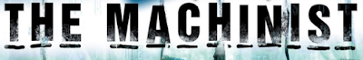
I think when looking at these two very different film posters, as a group we took more from ORION and its layout and image, as it was closest to our genre and themes.
Our Short Film Poster: On the Brink
Our four film posters for On the Brink:


My Design and Analysis:

When I first started to picture my film poster design for On The Brink, I really wanted to generate emotion to attract audiences effectively. I believe it is very important to have a clear message through the design in some ways, however, not too much context to give the story away, but enough to capture audiences attention to watch our film. All the elements I have included with my poster design all anchor a certain meaning or representation.
Representations:
Image: Represents the genre of our film e.g. - drama and social realism.
Title: Represents the intensity of the narrative and what audiences should prepare themselves for.
Laurel Leaves: Represents the success of our film influencing audiences to watch and review it.
Colour: Represents the faded vision which John has of his life as he becomes closer and closer to taking his life.
CONVENTIONS USED:
Within my poster design I made sure to imbed many independent poster conventions. This helps me understand the design and reasoning behind these decisions to include these conventions for independent films. Studying many independent short film posters also allowed me to gain understanding with what I need to pursue when coming to my own poster design for On The Brink.
Conventions I used:


I began designing my poster with a vertical design and similar image, however, I felt that this horizontal image fits perfectly to reflect our narrative as we are immediately introduced to our main character 'John'. Shallow depth of field is used purposely to slightly reveal the person behind him; his daughter Rebecca. I believe that this image generates an enigmatic response, this is because this image raises questions about why she is behind him and who is she. Our main actor's facial expression symbolises his character deep in the film where we begin to find out his personal struggles with life and himself. His frown and darkness under the eyes creates frustration and sympathy for John, making audiences wanting to watch the film. When I finally decided I would use this image I had one point that I argued against it. This was whether or not it revealed too much of the narrative, however analysing it thoroughly you cannot notice John is standing on the edge of a cliff and we do not know any context about the girl to the right of him in the background.
COLOUR:
 When designing the colour of my poster I made sure to keep colour rather than black and white as I feel it would represent this film in too much of a heavy and dark way. Therefore, in photoshop I lowered saturation and hieghtend the brightness to generate a slightly faded effect to the image to create a certain mood. I wanted to generate a mood of spine-chilling feelings, as this faded light colour resembles the chilling and shock value twists that are imbedded in our narrative. If I made this image too contrasted and dark I believe this would have given too much away with the choice of image, therefore designing the faded colour reflects Johns unclear vision of his life, therefore using this colour scheme it contrasts well with the plot of the film which in turn manipulates spectators to create more effective shock and surprise.

TITLE:
 Choosing a fitted font for the image was very challenging and I went through many trial and errors gathering different opinions from various people with different tastes. However, using this font I believe works best as my group have all used the same allowing us to use this for our titling sequence in our final product. The title is clear and bold, expressing the focus of the film 'BRINK', this work holds a lot of context as it connotes how John our main character is on the brink of taking his life. I chose this image with care and thought ahead to titling and positioning, this was important as I needed to allow myself enough room to have clear text and independent poster conventions. The way in which I placed the text it to represent the meaning of the titling. As you can see from the screen shot I have design the text to be towards the right so that there is a drop from the O to the T and then to the B, acting as a cliff in which John is located before he tries to jump off of Beachy Head.
INTENTED AUDIENCE:
 When looking at my poster design I feel as though I have successfully targeted our intended audience for our film which was 15-25 year olds. The poster expresses many social realism genre elements which I feel will attract people within that age gap to watch our film as they has experienced issues or struggles in their life in which they can relate to the image used. For example, our main character John's facial expression truly extinguishes that he is suffering from some sort of mental health illness, or even just reveals that he is hurt and depressed. These emotions can be transformed in a way of attracting people who have or are experiencing similar moments in their lives. This allows this audience to relate or produce empathy as they may no of someone who wanted to take their life. This poster represents a middle class status through the use of mise en scene micro techniques. John's shirt and jacket creates social assumptions such as it represents his middle class character, however, a deep hidden message from this and the film is that no matter how wealthy he is, money can't help his depression and addiction, indicating that money cannot bring you happiness, only kindness.

TONE:
When glancing at my poster draft design, you can gather a certain tone that is expressed. A chilling, cold and eerie tone is felt when analysing the tone. The micro techniques used within the poster including conventions all convey these tones. I personally feel that my poster draft successfully reflects the correct and fitted tone to the narrative we have created.
Overall I am very pleased with my poster design for our film On The Brink. There are small things I am not 100% with such as: whether or not the girl in the background gives too much away about the twist in the narrative, but I feel this poster authentically reflects our film in the correct way and will persuade target audiences.
Little White Lies Review
Who and what are LWL?


When analysing different examples of reviews from LWL's magazine, you can recognise that they all use a certain type of language which is at a high quality standard. For example using words in which sound very complex. Although, in some cases, the writers can come across in-formal, however, they do not let this take over their whole review, meaning that they use it in the correct way which still has a complex and academic tone when reading the film review.

Here are some english language techniques which are used in Little White Lies magazine film reviews:
-Complex nouns
-Metaphors
-Similes
-Restricted code in languages
-Rhetorical questions
-Puns
-Adjectives
-Adverb
Common Structure of Language in LWL's Film Reviews:
Analysing past film reviews from Little White Lies magazine such as, Jack Reacher, Life of Pi and Zero Dark Thirty, you can begin to recognise the pattern in the way in which the journalists structure the language.
In LWL's reviews, there are usually 5-7 paragraphs around 500 words. In each paragraph there is a purpose which delivers a message to consumers of the magazine.
Taking a look at the first paragraph in LWL's film reviews all have something in common. For example: these introductory paragraphs holds context of the film, such as information about the director and their past films or even historical and cultural events that have a significant link to the film that is being reviewed.
After the introduction, a pattern of summarising the key information about the protagonists and key players in the film. For example, evaluations on their performances and their traits and how they are represented throughout the film.
After these two important paragraphs which are a common pattern in most LWL's film reviews, it then moves onto the longest section which includes the rest of the paragraphs in the film review. The longest section usually explores the key themes, issues and the plot of the film. However, the writers of these sections of the review have to be extremely careful not to reveal any spoilers!
Once the key themes, issues and the plot has been brought up, the narrative devices are then discussed along with the adaption of genre conventions used within the narrative. This part of the review is important as it allows readers to understand which genres the film demonstrates as audiences have their preferences and favourites.
Although the reader is a key part in the film review, the reviewer has to give their own view of their experience of the film, showing their opinion on the film and the director. By the writer giving their own opinions on the film, helps audiences respond back by relating to the points that are made in the LWL's review.
 Finally, a summary sentence is used to evaluate the whole film. This is a chance to use words which summarise the film in one sentence, however not giving too much away, or using too many persuasive techniques so therefore it does not put people off from seeing the film or even buying it.


QUESTION 2 - How effective is the combination of your main product and your ancillary tasks?
Script for Video:
All films, short or feature length, high or low budget require a good marketing campaign in order to be successful. As part of our A2 Media coursework we had to create a short film lasting 5 minutes along with a film poster and film review for that short film. Having ancillary products are vital for your main product as it allows you to target your correct target audience and deliver it to them.
A very popular way to successfully create a marketing campaign is designing a film poster for that film which introduces the film to your target audience to entice them to watch the final product. However, once the distributor have found the campaigns unique selling point, then they can begin the campaign. It needs to capture the attention of viewers as it will be competing against many other campaigns in the film industry. Whether your campaign is on TV or on the side of a bus or even submitting it to a short film festival which help young filmmakers get their work out there, however, it needs to work together in synergy to promote the film and to gain recognition and for it to be original so that it can easily be noticed creating word of mouth. Many elements in a campaign can hold a reputation, for example the logo or the title. Many films do this, for example, Marvel films such as The Avengers who have a well recognised title on their film posters. Audiences will then begin to associate these films with Marvel making each of their own a success.
We ensured that our own film posters had something recognisable and memorable to our target audience. Our unique selling point was our images, including our main protagonist, John. Therefore, his face can begin to be associated with our film On the Brink and our company HENN Productions along with our simple yet effective logo. John's facial expressions on our posters draw target audiences in, questioning what he is experiencing, also this technique in using these certain images creates an emotional response from audiences as they may be able to relate to the characters expressions along with the faded colours and black colours that we used. Therefore having this persuasive technique brings consumers. Having a film poster as part of your marketing campaign is extremely important as it reflects many elements which attracts your target audience, for example, it allows people to recognise the type of genre the film is, drawing in that target audience who enjoy dramas or thrillers. Film posters also slightly conveys some context of the film to the target demographic, enticing them to go and watch the film.
Our film posters reflect the genre through its colouring, imagery and layout. Its image of John suggests social realism, reflecting the depressive facial expression which connotes mental health awareness. However, the isolation and language that the title uses expresses the film in a way of a drama genre. Over all, the film poster combined with the film successfully reflected its genre and conveyed some context without giving too much, making our target audience wanting to know more.
Another efficient marketing method would be to use a film review from a magazine like Little White Lies. This is a great way for your target audiences to hear from journalists and their opinions on the film before they go ahead and watch it. It allows them to learn more about the style and theme of the film. The film review and film poster work in synergy to convey aspects of the film, however, without revealing too much context of the narrative. Having a film review being apart of your marketing campaign for you film can be a risk though, this is because it is critical and includes bad and good comments which may put of a potential large audience. Taking into account that Little White Lies is writing the film review may make your target audience change, this is because their target demographic is 25-35 year olds. Also looking at statistics from their company in 2008, 68% of their audience and consumers were male, however, it is clear that LWL's have done this purposely to appeal to this type of audience. Their target audience and consumers will have a great interest in films and reading critics on films. LWL's states that 93% of their readers keep the copies after reading them, connoting the importance a review can have on a target audience, effecting whether or not they go to watch that film.
The cost of a Little White Lies magazine is around £6, however, this is due to the high quality materials that they use. It takes them approximately 3 months to bring out a new edition, this is because of the extent of hard work that is put into producing this ancillary product. Handling a finished version is almost handling a piece of art. Their editions have different textures and themes overtime. Their magazines seem to attract a higher-class consumer due to the quality of their editions. They are completely different compared to a mainstream magazine such as Heat or OK! These mainstream magazines sell for around £1.65. However, some offers allow you to purchase 4 editions for £4. These mainstream types are just simply paper printed and easily ruinable.
The language of Little White Lies tends to be very complex, however, having a chatty tone at the same time. This is a very difficult technique to conquer because of the unique technique when grabbing the audience when reading the reviews. They use very friendly language and use a range of styles when writing in order to appeal to their target demographic. They use language techniques such as:
-Rhetorical questions
-Metaphors
-Puns
-Similes
-Nouns / Complex nouns
-Adjectives
-Adverbs
-Restricted codes in language
When beginning to plan our LWL's film review, we found it very challenging to mirror their conventions and styles. However, with lots of research and reading into their own editions we planned paragraph by paragraph, learning language in which sounded complex however light and friendly. I feel as though as a group we have successfully replicated a LWL's film review, however, applied it to our own film On the Brink. One thing we received criticism on was how we went into too much detail, therefore, once making our expressions more simple and using complex language, made all the difference and sounded like a review when reading it back several times. The rating system was one of the main elements of the review. We decided to be fair when allocating numbers out of 5 as we did not want to come across as if we did the best, because we did not. Although we felt we were successful in all three products, we did not want to be biased. So we kept the ratings average. We also received feedback on the review from our target audience and they all agreed by saying how well written it was and that it did not give too much away of the film. I believe as a group we successfully wrote and designed the LWL's review.
My Video
QUESTION 3 - What have you learned from your audience feedback?

The most important lesson I have learnt is that audience feedback is a vital part of the making of a short film or any film. Audience feedback stands as a platform in which you can gather advice to enable you to change elements to make your product even better. Throughout our advanced portfolio we managed as a group to collect a substantial amount of audience feedback which helped us in so many ways to make our film, poster and review a whole lot more successful!
When collecting audience feedback we made sure we gathered in different formats, here are the formats we used to gain our feedback on our film, poster and review:
(We assured to collect audience feedback from our target audience of 15-25 year olds to make it a fair test to our film, poster and review!)


Asking these questions before finalising the idea and going ahead to film it was a very sensible idea. This allowed us to change parts of the narrative, for example, adding more context on the Father character and creating more mystery through the use of camera techniques. We used more shallow depth of field and pull focus to generate a sense of enigma. So, by having these answers as a guide, it really improved our films story as a whole.
Feedback from Media Class (our target audience)

Colour Key:
Positive comments
Critical comments
QUESTION 4 - How did you use new media technologies in the construction, and research, planning and evaluation stages?
 Press here for my Q4: PREZI
Pre-Production - Exploring short films and looking into what conventions make a good short film
When beginning our Advanced Portfolio we each had to research into 4 or more short films to become familiar with the typical conventions of a short film. This meant analysing these short films enabling us to identify ourselves with the features imbedded into these short films. When analysing these short films, we had to apply MRANG concepts, which are: Media language, representation, audience, narrative and genre. Whilst completing this task I learnt a variety of different techniques and elements in which are all used differently in the narrative of the short films, revealing the range of structure a short film can have. Throughout this task I began to learn what a short film really is, meaning this would help me produced a successful short film. It is vital to understand what a short film really is.
A short film is any film not long enough to be considered a feature film. Although no consensus exists as to where that boundary is drawn, the Academy of Motion Picture Arts and Sciences defines a short film as "an original motion picture that has a running time of 40 minutes or less, including all credits". Short films are usually funded by personal funds, film grants, non-profit organisations, this means short films are typical of a lower budget compared to your big feature length films. Shorts films are a great way to begin as a filmmaker, to try and create a platform yourself. This can be done by submitting your short films to short film festivals such as, London Short Film Festival which occurs every year helping filmmakers get their talent out there.
Short films commonly include features such as:
- Released by independent film companies
- A small cast, usually between 3-4 characters
- One protagonist throughout
- 5-10 minutes in length
- Very realistic
- Most common form is animation or live action
- Never well known actors
- Low budget
- Voice-overs or narration to deliver the message to the audience more quickly
- Contains a twist
- Todorov's narrative theory is mostly always applied beginning with an Equilibrium
When taking these typical conventions into consideration I believe that as a group we successfully used these features to make our short film more professional and typically a short film. By learning the full definition of a short film and all the elements that come with it, really pushed us as a group to fully take all of the features into consideration, giving our film structure and balance.
I researched into 7 short films which acted as a guideline in what short films are supposed to look like. By the second or third analysis that I wrote, I knew exactly what was needed to make a successful short film.
-Media Language
-Representation
-Audience
-Narrative
-Genre
Short Film 1: UNWIND
This short film Unwind is based on a novel written by Shusterman. It is directed by a man named John Lyde. This short film emphasises certain issues, for example the subject matter of this film is abortion.
This short film opening begins with titling explaining the occurrence at this present time. Then a sound bridge is used from the titling to the first shot that we see which is an extreme close-up of an eye, slightly watery representing the fear being exposed from the quick side to side movements of the eye. The opening shot is extremely powerful as we are only introduced to the girl from looking at her eyes. We are not offered a long-shot of her body nor are we given the girl’s name. This suggests she’s unimportant, implying she is not the only person to under go this operation. This can immediately be linked with our opening shots in On the Brink, this is because we are introduced to a couple, however, are given no context at first, until they begin to speak. Through the use of the many point-of-view shots we as spectators are made to feel as if we are the girl and this builds our fear and despair for the character, generating sympathy. In On the Brink we use a point of view shot when Jenny rushes in to wake up Rebecca, we blurred this shot manually to express that Rebecca had just woken up. The point of view in UNWIND generates a sense of enigma codes as in these few seconds of the first shot, spectators would question who is this and what is happening? Although we are never given an establishing shot to confirm our reading of the location, we can use costume, sound and lighting to inform us that this film is set in a hospital environment. The diegetic sound of a heart monitor is a not a visual semantic give away, however, we associate this sound effects with hospitals.


 |

The characters in this short film can be split into two categories with typical character archetypes. The doctor and nurse would be the antagonist and the girl is our protagonist. However the girl and the nurse are our leading roles as they have the most dialogue throughout. We can compare these characters to our film, although we have a cast of six people, we mainly have two protagonists, John and Rebecca whose relationship is Father and Daughter.

The costume that the doctor wears is a stereotypical costume for medical staff. Since this character is operating on the girl we can assume he is the doctor. What actually heightens the fear and tension when we know the doctor is taking the girl through the unwinding process, is the fact that what we know about doctors is that their purpose to help save lives. That is why they can be some of the only people we can put all our trust in. But since we know he isn’t doing something good, in reality he is disillusioned with the rest of society, it’s like a kick in the stomach to be put in this girl’s position and to therefore feel so deceived by someone who should be morally good.
Throughout this short film, we are constantly being positioned into the patients perspective, this is done using a high frequency of shots of point-of-views. We did this by using many extreme close-ups of John to be fully immersed within his mind and his emotions that he is experiencing with his depression. The effect this has on our target audience is that they become more connected with our characters, making them more relatable.
   |
Point-of-views are effective to spectators as it positions us to put ourselves into their position, trying to imagine and feel the emotions they are feeling, creating sympathy and a feeling of hopelessness. A significantly important element of this short film is the use of focus-pulls and shot-reverse-shot as it has been planned to every detail. Although the editing is very primary by using just cuts and fades to black, the use of focus-pulls are used in replacement. These camera techniques help signify realism as she is drowsy her sight is never fully focused, which is shown through numerous focus-pulls, almost as if she is not the only one under anaesthetic, we as spectators are too.
You can notice that we only ever see the protagonist eyes and we do not see anymore of her. This then gives the film a deeper and evocative overlook on the girl, making the audience feel more connected to her. Using extreme close-ups increases the recognition of her facial expressions, making it more engaging for spectators.

The diegetic sound of the girl's breathing is audible throughout the procedure, which stresses the characters tension when she begins to panic. It's hard to understand at first but throughout the film, low, ominous non-diegetic music plays in the background which crescendos in volume as the girl begins to panic. This then builds and becomes more erratic as it reaches a crescendo the moment before the girl finally can't see.

Dialogue is also vitally important because it is the speech that develops characterisation. In this short the nurse constantly speaks to the girl in a very feminine and soft tone, saying such things as 'sweetie' which, when we realise what is happening, sounds very patronising for the protagonist. The fact that this nurse is so endearing and soothing is a shock to the audience because we feel, like the girl, cheated and full of disbelief: after all, how could someone so nice happen to be a part of something so evil? It is also subverting the stereotype for 'a killer', however she is not the direct killer.

The genre of this short film is established through the iconography. For example, the iconography of Sci-Films usually includes futuristic weapons. However, we are barely even shown much of what is happening in Unwind, which then makes spectators guess from the use of Mise-en-scene, editing, camera work and sound. Identifying one piece of iconography which is genre-specific is the cleanliness of the environment in the setting and since so many Sci-Fi films will always be binary opposite locations: either a dirty, disused area or a shiny, new, clean environment. In this case, the film conforms to a stereotypical location.
Short Film 2: Portal: No Escape
The short film, Portal: No escape is a live action film directed by Dan Trachtenberg. The genre of this short film is sic-fi, this can be recognised through the micro and macro elements. For example: the cinematography is made to fit typical science fiction conventions within a film.
This short film has a chronological and linear narrative like our short film On the Brink. The director of Portal: No Escape would have chosen this to express their creative vision effectively without generating any confusion for the spectators. By applying Todorov's five stage narrative theory, we can identify the clear equilibrium form the start, as we are in a isolated setting, clueless of where the woman is located, although this is not presented as normality, the setting and props are used to create semantic codes in terms of Rick Altman's genre theory, enabling us to signify that this is realism in ski-fi. The small isolated room she is held in also gives away that she is the protagonist, not your typical damsel in distress and it also shows that the people who have locked her away are the antagonists. These characters can be applied to Rick Altman's genre theory too as they are typical characters of a certain genre, these are called syntactic codes.

The shot that most commonly presents science fiction at its best would be the frequent use of medium-shots, making spectators to follow the protagonist and also allowing spectators to both experience and be positioned into the protagonists perspective and also recognise the setting around her. There is no opening title scene in this short, instead it begins with a close-up of a background, no characters or any information of what is about to take place. After a few seconds, we hear a diegetic gasp as a woman bolts upright and stares in front of her. The close-up reveals her facial expression; shock and anxiety, which then generates enigma codes as we are unsure what has happened to her. Other questions from spectators generating enigma codes could include:
Where is the room?
How long has she been kept in there?
Who put her in there?
What has she done to be kept in there?
When or will she escape?
These techniques generate enigma making questions arrise from the narrative. This is a similar technique which we used throughout On the Brink to immerse our target audience and make them ask certain questions, such as, where is John? and why is he suffering from drug addiction and depression?
However, the director has carefully used this close-up to present the type of mood he would want spectators to feel; anticipating the next shot.

 A long-shot is used to show her standing up from when we woke up, this is effectively used to show the setting and noticing how isolated she is. The décor, dull colour and low-key lighting are all significant micro elements that help us identify the genre; sic-fi. As we track the woman, she notices blood on her hospital gown, generating an enigmatic response from spectators, questioning why she has blood on her gown and neck. A match on action is used when she smashes the mirror to get a shard of glass to check her neck, match on action is used to help the flow of continuity editing, allowing the shots smoothly cut, therefore does not look disjointed. A close-up of her neck reveals a bar code that has been imprinted onto her.
The imprinted bar code on her neck generates a sympathy response from spectators as we put ourselves into her position, making us feel scared and trapped inside that isolated room. A high-angle extreme long-shot is used with a live camera filter, this is representing the idea that she is being watched by guards. As she recognises the CCTV, we begin to see a high-frequency of cuts of her exercising, parallel to this would be the non-diegetic soundtrack as it crescendos matching her actions in the scenes. This builds intensity through the shots, cross-cutting is used to show two different situations, her exercising and when she is eating her food that the guards give her whilst she reads the wall, all encoded with lines of numbers. This acts as the recognition of the disruption according to Todorov as we can notice how she is solving some sort of puzzle. This is shown through the camera tracking her allowing us to clearly understand her actions, also close-ups to identify certain facial expressions, for example: we she comes closer to escaping, she has sudden smirks and grins.


The codes and lines on the wall could identify with the barcode on the back of her neck, making it a way out of there. The code on her neck could be the code to escape. Pull-focuses has been specifically used to put the desired object in focus, for example: the woman is put in focus in a medium close-up to enable engagement between her character and spectators. Over the shoulder shots are also used to position spectators, for example: when she is almost studying the codes on the wall, the camera is placed behind her, pull-focusing from the wall to her, putting us into her position as if we are there with her and looking at the same wall as her making us more involved.

Finally she finds an opening in the wall using the codes, a medium-shot of her holding the portal gun is shown as if we were in the wall being positioned to look at the woman and engage with her achievement and sense of hope of escaping. The portal gun is a vital piece of visual iconography that associates itself as a prop of part of the ski-fi genre. This can be applied using Rick Altman's theory of semantic codes, as the portal gun would be a semantic code to the genre of sic-fi.

Medium-shots are used to show her body language and facial expression and she begins to figure out what the portal gun does. She points it towards the wall and pulls the trigger. A large orange coloured circle appears on the wall, a medium close-up is used to represent her facial expression full of amazement and astonishment. She slowly enters her hand into the hole. It then cuts to a long-shot to show her pulling the trigger onto the other wall creating another portal which is blue reflecting high-key light into the setting, emphasising a sense of achievement. She enters her hand into one hole noticing her hand come through the other, at this moment she realises it is a portal gun; meaning she can go anywhere.


As her next meal was served, she pulled the trigger when the door was opened by the guard allowing her to export herself to the 'outside'. Tracking is used to create a sense of following her and running away with her, as it generates a sense of relief from spectators, connecting more with the protagonists identity. Low-angles from then are used frequently to represent her as a protagonist and more superior to the guards chasing her, each of the guards fails to do so making her the most dominant character of all.


The final scene shows that she has now escaped and in the outside, however the director tricks us and he inserts a plot twist into the narrative. This is created by making the setting look realistic as if she were outside, but as she goes to put her hand out, a medium-shot explains how she cannot put her hand out, as the setting is actually a screen. This generates a shock value response from spectators as hope would have been built and a sense of relief, then we are back to the start, a feeling of isolation, entrapment and confusion.


The concept of this short film inspired me because the way in which they used portals to portray sic-fi is interesting and not a typical convention of sic-fi films, however it is very much sic-fi as micro and macro elements represents iconography and semantic codes of the genre, allowing us to identify with the themes of the short film. Although this short film inspired me, I did not use sci-fi as a genre in my short film as it would not implement our narrattive and structure of our characters. However, I would love to experiment with VFX and improve my knowledge of it too in the future with film projects.
Both of these short films are great examples of short films, they both use conventions to reinforce the short film structure. For example, both films used minimal characters in both narratives.
Both of these short films are great examples of short films, they both use conventions to reinforce the short film structure. For example, both films used minimal characters in both narratives.
Our Short Film: On the Brink

Our short film follows many of the short film conventions, however, in some cases challenges and develops conventions in the narrative. For example, we were very experimental when casting. In total we had a cast of 6 people, making it very challenging for us when filming with all 6 characters. However, this improved our organisational skills and allowed us to multi-task.
In On the Brink we made sure to stick to key conventions of a short film including:
- The length of the film which was just over 6 minutes.
- Had a chronological order.
- Explored real life issues e.g. - mental health issues / drug addiction.
- Voice-over to enhance an emotive response from spectators and to quickly deliver a deep message, however, in an effective way.
However, we challenged some conventions:
- We did not have one main protagonist, we had two, a Father and his Daughter. This was needed as it balanced the structure of the narrative by understanding that someone is always listening no matter how much you are suffering.
- We had quite a large cast for a short film. We had 6 characters who all played a significant role which implemented to the story of the Father, John. If we had less characters it would have made the narrative slightly more unclear and more engaging.
9 FRAME ANALYSIS: ON THE BRINK

 |
| Long-shot of Rebecca and Alfie arriving at John and Jenny's house |
 |
| Long-shot pan of family eating their dinner |
 |
| Parallel cut close-up between Father and Daughter |
 |
| Extreme long-shot of John in church in town |
 |
| A P.O.V of Rebecca being woken up by her Mother Jenny |
 |
| Medium-shot of Rebecca reading her Fathers note he left at the church |
 |
| Close-up of Rebecca reminiscing her and her Fathers favourite place (Flashbacks) |
 |
| Extreme close-up of John questioning to jump and commit suicide |
 |
| Shallow depth of field of John and Rebecca running to stop her Father from committing suicide |
Short Film Posters
Short film posters have a range of typical conventions that are used to promote and attract audiences when seeing them in the streets or even more so now, on social media. Here are some of the common conventions used in order to make a successful film poster:
- Laurel leaves connoting film awards
- Billing block to show credits
- Reviews from magazines etc.
- Sponsors
- Company logo
- Title of the film
- Website
- Social media icons
- Name of actors
- An image from the film
As part of my Pre-Production planning for our short film, we had to research into several film posters to grasp the understanding of what conventions are needed in order to design and produce a successful film poster to do our short film justice. I researched into low and high budget films, enabling me to understand what is needed for short films, so that I don't end up creating a short film poster which has elements of a higher budget film poster conventions in.
Short Film Poster 1: ORION (Low-Budget)

This film poster for Orion uses many micro techniques to represent certain meanings. The low-key lighting and high contrast colour generate a dark outlook on the narrative, however we can contrast this with the stars which are clustered around the title. This can add a sense of positivity to the film. The tagline which states "A moment on earth. A lifetime in the stars" This anchors the image of the land and the stars. However, it is still quite unclear as to what the full hidden message is to spectators. I personally feel as though the message the poster is sending is that, we should appreciate life as it can be taken away so quickly.
 |
| This is the tagline from the poster. However, we can argue that this is not being true to short film poster conventions as we only really typically see taglines on feature length film posters, this is because it adds more context and another technique is which is promotes and sells the story. This in turn makes people more likely to want to go and watch it in the cinema. |
The low-key light creates silhouettes around the two people featured in this poster, hiding their identities. This may be done on purpose so as spectators we question who and what the characters are about. We can immediately notice that the theme of this short film is based on the army, this is represented through the use of props and costumes. Large equipment is being worn such as: helmets and goggles, also guns are being held which implement the theme and messages of the film. This couldconnote that the genre of this short film is apart of action, drama or social realism. It could combine all three to create a hybrid genre which happens if we apply Steve Neale's genre theory.
The images that represent certain micro techniques connote many ways in which could build a response from spectators. For example: the fact we can notice it is set within an army could trigger empathetic emotions for people who have experienced time in the army or who have ever lost someone close because of the war they fought in.
The fade between the colours on the poster could represent the way in which thenarrative of the short changes half way through, transforming from dark themes to happiness. The narrative the images express is through an inspirational meaning, as though one of the characters has a story to tell their audience.
Positioned at the bottom of the poster frame is the billing block. This is to showcase who has been involved, the funding of the short film and the sponsorship. This is a typical poster convention with all films, short or feature length. The theme which is represented through the visual elements of mise en scene being applied through this short film poster can indicate what target audience they are aiming. I feel as though this short film is targeted towards a rounded demographic, including female and males aged between 15-25 year olds.

When it came to choosing film posters to research into, I chose this short film poster as I feel it had extreme relevance to my own film poster ideas that I had for On The Brink. However, not through the meaning but through the visual elements of mise en scene. For example, one of the images we used is a silhouette of John. I feel as though Orion helped me gain more of an idea with what colours I wanted to use to successfully convey the correct message of the social realist and dramatic film.
The fade between the colours on the poster could represent the way in which thenarrative of the short changes half way through, transforming from dark themes to happiness. The narrative the images express is through an inspirational meaning, as though one of the characters has a story to tell their audience.
Positioned at the bottom of the poster frame is the billing block. This is to showcase who has been involved, the funding of the short film and the sponsorship. This is a typical poster convention with all films, short or feature length. The theme which is represented through the visual elements of mise en scene being applied through this short film poster can indicate what target audience they are aiming. I feel as though this short film is targeted towards a rounded demographic, including female and males aged between 15-25 year olds.

Short Film Poster 2: The Machinist

The Machinist a British film which was released in 2004 and was not successful in box office, was very successful with critic reviews and audiences. However, it had a $5 million budget. This poster has a very interesting and busy layout. The layout of the poster can represents multiple perspectives on the narrative, conveying many meanings and messages that the poster designer wanted to reinforce and generate for audiences.
The composition of this poster focuses on the films main protagonist, Trevor Reznik, played by Christian Bale where he is scattered and fitted along the top of the poster. Not only does this suggest he is the protagonists and main character but also could connote that the film is going to explore all the different sides to Trevor's fragile personality. This can be represented through his various facial expressions in his different images on the poster. They vary from the first face on the left looking bewildered and then the last face on the right looking very vulnerable. This unorthodox approach showing four images of Trevor's face implies that this film could have some physiological themes to engage spectators and to change their perception of reality.

The light and dark colour scheme that is used generates a low-key light effect across the whole poster, however giving it some contrast with the lighter blues to create differences in the poster, otherwise it could be too plain and boring. These two contrasting colours may suggest that these images that we see on the poster are from flashbacks of Trevor, which is another typical psychological genre film convention. The unorthodox elements that are being applied in this poster generates enigma around this character, leaving many raised questions from spectators. The target audience from what I can see from the poster would be aimed at a mature audience of both genders, however I wouldn't say that this film was targeted towards a younger audience, especially if it has heavy psychological themes. I have learn't how important lighting is for a film poster as it can reveal many hidden messages and hints to what themes and genres are involved in the narrative.

In this poster, a tagline is applied which is a tiny post note of an unfinished game of hangman with only two letters found at the end of the word. Next to the post note it quotes "Trevor Reznik is four letters away from the truth." This represents and can reveal some of the themes of the film, for example, he may be searching for something important and significant to himself. The title also uses the hangman effect, this continues to tease the audience by connoting that the main protagonist, Trevor is being shielded from finding out the truth, which can also be considered as having some genre conventions of a thriller. Therefore we are positioned to root for him and for him to find out the truth, although we still don't know the full context of the film, we only guess from the film poster.

I think when looking at these two very different film posters, as a group we took more from ORION and its layout and image, as it was closest to our genre and themes.
Our Short Film Poster: On the Brink
Our four film posters for On the Brink:


My Design and Analysis:

Representations:
Image: Represents the genre of our film e.g. - drama and social realism.
Title: Represents the intensity of the narrative and what audiences should prepare themselves for.
Laurel Leaves: Represents the success of our film influencing audiences to watch and review it.
Colour: Represents the faded vision which John has of his life as he becomes closer and closer to taking his life.
CONVENTIONS USED:
Within my poster design I made sure to imbed many independent poster conventions. This helps me understand the design and reasoning behind these decisions to include these conventions for independent films. Studying many independent short film posters also allowed me to gain understanding with what I need to pursue when coming to my own poster design for On The Brink.
Conventions I used:
- Laurel Leaves for film awards
- Billing block to show credits
- Reviews
- Sponsors
- Company logo


MAIN IMAGE:

I began designing my poster with a vertical design and similar image, however, I felt that this horizontal image fits perfectly to reflect our narrative as we are immediately introduced to our main character 'John'. Shallow depth of field is used purposely to slightly reveal the person behind him; his daughter Rebecca. I believe that this image generates an enigmatic response, this is because this image raises questions about why she is behind him and who is she. Our main actor's facial expression symbolises his character deep in the film where we begin to find out his personal struggles with life and himself. His frown and darkness under the eyes creates frustration and sympathy for John, making audiences wanting to watch the film. When I finally decided I would use this image I had one point that I argued against it. This was whether or not it revealed too much of the narrative, however analysing it thoroughly you cannot notice John is standing on the edge of a cliff and we do not know any context about the girl to the right of him in the background.
COLOUR:
 When designing the colour of my poster I made sure to keep colour rather than black and white as I feel it would represent this film in too much of a heavy and dark way. Therefore, in photoshop I lowered saturation and hieghtend the brightness to generate a slightly faded effect to the image to create a certain mood. I wanted to generate a mood of spine-chilling feelings, as this faded light colour resembles the chilling and shock value twists that are imbedded in our narrative. If I made this image too contrasted and dark I believe this would have given too much away with the choice of image, therefore designing the faded colour reflects Johns unclear vision of his life, therefore using this colour scheme it contrasts well with the plot of the film which in turn manipulates spectators to create more effective shock and surprise.
TITLE:
 Choosing a fitted font for the image was very challenging and I went through many trial and errors gathering different opinions from various people with different tastes. However, using this font I believe works best as my group have all used the same allowing us to use this for our titling sequence in our final product. The title is clear and bold, expressing the focus of the film 'BRINK', this work holds a lot of context as it connotes how John our main character is on the brink of taking his life. I chose this image with care and thought ahead to titling and positioning, this was important as I needed to allow myself enough room to have clear text and independent poster conventions. The way in which I placed the text it to represent the meaning of the titling. As you can see from the screen shot I have design the text to be towards the right so that there is a drop from the O to the T and then to the B, acting as a cliff in which John is located before he tries to jump off of Beachy Head.
 INTENTED AUDIENCE:
 When looking at my poster design I feel as though I have successfully targeted our intended audience for our film which was 15-25 year olds. The poster expresses many social realism genre elements which I feel will attract people within that age gap to watch our film as they has experienced issues or struggles in their life in which they can relate to the image used. For example, our main character John's facial expression truly extinguishes that he is suffering from some sort of mental health illness, or even just reveals that he is hurt and depressed. These emotions can be transformed in a way of attracting people who have or are experiencing similar moments in their lives. This allows this audience to relate or produce empathy as they may no of someone who wanted to take their life. This poster represents a middle class status through the use of mise en scene micro techniques. John's shirt and jacket creates social assumptions such as it represents his middle class character, however, a deep hidden message from this and the film is that no matter how wealthy he is, money can't help his depression and addiction, indicating that money cannot bring you happiness, only kindness.
TONE:
When glancing at my poster draft design, you can gather a certain tone that is expressed. A chilling, cold and eerie tone is felt when analysing the tone. The micro techniques used within the poster including conventions all convey these tones. I personally feel that my poster draft successfully reflects the correct and fitted tone to the narrative we have created.
Overall I am very pleased with my poster design for our film On The Brink. There are small things I am not 100% with such as: whether or not the girl in the background gives too much away about the twist in the narrative, but I feel this poster authentically reflects our film in the correct way and will persuade target audiences.
Little White Lies Review
Who and what are LWL?

This Youtube video demonstrates the making and immense effort that is put into the creation of the LWL magazine. LWL magazine is made in London in a small block of offices in the Church Of London. A group of 25-35 year olds make this magazine. Each edition of a magazine is sold every other month due to the extensive amount of work that goes into producing each issue.
Little White Lies is an independent film magazine that employs cutting-edge writing, illustration and photography to get under the skin of cinema. LWL who were tired of the mainstream types of magazines then decided to launch their own publication in 2005. They wanted to introduce a new voice to the movie landscape, and offer readers an alternative to the me-too mediocrity that dominated the industry.
Here are a few issues from Little White Lies:


Each issue, Little White Lies takes a new lm as the blueprint for its aesthetic while at the same time retaining a sophisticated look all of its own. Little White Lies is a magazine about films. However, it is more than that, it’s a magazine about everything, for everybody. Little White Lies is for people who hear the echoes of films all around them, who carry the lms they love within them and nd them inspirational. It’s a celebration of life, 'truth and movies'.
They now have 34 issues under their belt and they have earned their place in the UK’s movie scene. They are the freshest, most energetic voice in the market, and they are here to stay.

This screenshot from Little White Lies shows where they distribute their magazine, demonstrating the incredible success they have had, distributing all over the world.

Little White Lies also have online versions of their issues. Littlewhitelies.co.uk is an unmissable daily resource for lm fans, featuring exclusive reviews, interviews, opinion, new lmmakers and festival reports from around the world. It is designed and maintained by LWL in-house team, it’s the daily connection with their readers that plugs the gap between bi-monthly releases of the magazine itself, which allows them to further build the relationship with their audiences.


The Design
The design and structure of LWL's is inspired by a feature film which is represented by the cover of the magazine, this can be easily recognised through an illustration on the front cover, usually of the lead actor or actress in the feature film. This is done in a very creative and artistic way. They use different materials and card rather than shiny paper, making it have more sentimental value. The design of the magazine remains the same throughout their different editions to mainly create a persona and a recognised reputation for the institution. Other pages in LWL's magazine consist of adverts, but not too many like a mainstream celebrity gossip magazine such as OK magazine or HEAT, which consists of lots of adverts and pages that are trying to sell you items. Here are a few examples showing how different LWL's are from these mainstream magazines:


LWL Language & Structure
Little White Lies Language


When analysing different examples of reviews from LWL's magazine, you can recognise that they all use a certain type of language which is at a high quality standard. For example using words in which sound very complex. Although, in some cases, the writers can come across in-formal, however, they do not let this take over their whole review, meaning that they use it in the correct way which still has a complex and academic tone when reading the film review.

Here are some english language techniques which are used in Little White Lies magazine film reviews:
-Complex nouns
-Metaphors
-Similes
-Restricted code in languages
-Rhetorical questions
-Puns
-Adjectives
-Adverb
Common Structure of Language in LWL's Film Reviews:
Analysing past film reviews from Little White Lies magazine such as, Jack Reacher, Life of Pi and Zero Dark Thirty, you can begin to recognise the pattern in the way in which the journalists structure the language.
In LWL's reviews, there are usually 5-7 paragraphs around 500 words. In each paragraph there is a purpose which delivers a message to consumers of the magazine.
Taking a look at the first paragraph in LWL's film reviews all have something in common. For example: these introductory paragraphs holds context of the film, such as information about the director and their past films or even historical and cultural events that have a significant link to the film that is being reviewed.
After the introduction, a pattern of summarising the key information about the protagonists and key players in the film. For example, evaluations on their performances and their traits and how they are represented throughout the film.
After these two important paragraphs which are a common pattern in most LWL's film reviews, it then moves onto the longest section which includes the rest of the paragraphs in the film review. The longest section usually explores the key themes, issues and the plot of the film. However, the writers of these sections of the review have to be extremely careful not to reveal any spoilers!
Once the key themes, issues and the plot has been brought up, the narrative devices are then discussed along with the adaption of genre conventions used within the narrative. This part of the review is important as it allows readers to understand which genres the film demonstrates as audiences have their preferences and favourites.
Although the reader is a key part in the film review, the reviewer has to give their own view of their experience of the film, showing their opinion on the film and the director. By the writer giving their own opinions on the film, helps audiences respond back by relating to the points that are made in the LWL's review.

Little White Lies Film Review Plan
When researching into LWL's and their structure we began to plan as a group our film review. We structured it bit by bit. We had learn't the conventions and language that is used by reading many examples from LWL's themselves.
Context of each paragraph:
1) Context and summary of key protagonists
2) Key themes, issues and the plot
3) Narrative devices
4) Use of genre conventions
5) Reviewers experience and summary final sentence evaluating the whole film
Description of context in each paragraph:
1) Introduce the two main protagonists and how they are constructed. Talk about how the film makes John and Rebecca’s characters clear to make the end of the film make more sense.
2) Depression and other issues are more relevant in todays society and raises awareness for mental health. Discuss how the context is well suited to the narrative. Cover the main elements of the plot and how they are constructed.
3) How the film progresses with certain emotions from happy and normal to intense and depressing. Discuss how devices such as flashbacks add suspense and sympathy towards our two main protagonists. These devices allow you to understand the film better.
4) How the genre changes from a happy upbeat mood using conventions of the rom-com genre including your archetype characters such as typical girlfriend boyfriend meeting the parents then talk about how the genre transitions into a drama with elements of social-realism and thriller. Comparisons to other dramas such as our previous AS films.
5) Generally positive summary, especially praising the ending. Flags issues with the slow beginning, however state that this was probably intentional to contrast intense ending.
Ratings:
Anticipation- 4 – A unique hybrid twist
Enjoyment- 3 – A bit slow to begin with
In retrospect- 4 – Overall powerful and thought provoking
LWL's Target Audience

- The audience for Little White Lies corresponds very well with our target audience for On The Brink, targeting 25-35 year olds. LWL has a very similar fan base as the people we too would like to attract, with our short Drama being well suited to this age group through the themes and issues we cover, such as: mental health issues which are extremely common. Characters in the film like Rebecca and Alfie fall into this same age group so should make the film more attractive to the LWL readers.
- 60% of their audience is male, which is appropriate to On The Brink as we are targeting a predominantly male audience, with the core issue of suicide being most relevant to this demographic. UK group Samaritans found in 2015 that the male suicide rate is the highest since 2001. This statistic not only supports Little White Lies as an appropriate magazine to review our film, but also demonstrates how we are covering very recent and important issues in this film, which should enable us to reach a wider audience.
Templating our Film Review:
When we had written our film review we were trained in using InDesign, which is an Adobe software especially used for strutting articles or reviews. Here is my annotated template which was used for our film review. It has exact measurements to match LWL's film reviews, matching their conventions and features.
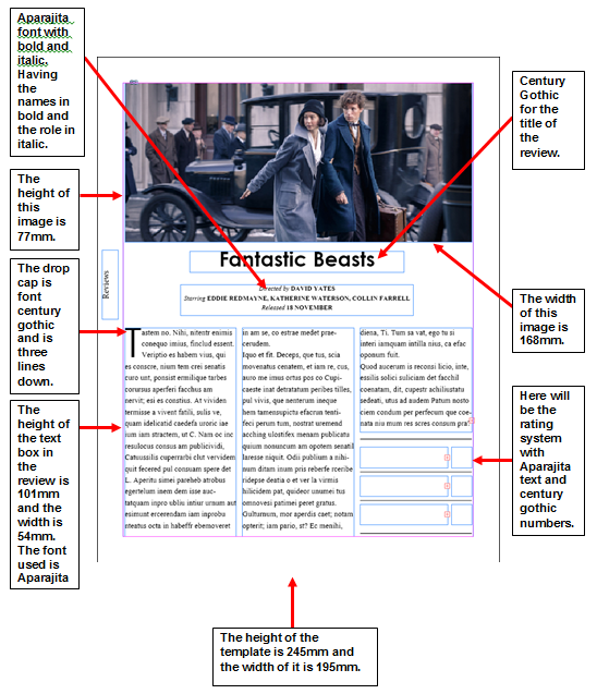
Our final film review:
When analysing our film review, I believe that we have successfully structured and used the correct language in order to create a professional film review, extremely similar to Little White Lies. We have used all conventions that LWL's has used, however, suited it to our short film, On the Brink. The annotated template above reveals all of the conventions used.

In our film review we used all the typical conventions used by Little White Lies. This included certain fonts, colours, header image and measurements. When selecting the image to use for our film review, it was extremely important not to choose an image which would give too much context away about our short film. However, in our film posters there is slightly more lee-way with this type of representation of our film. Selecting the image from our flashback was important as it completely hides the disruption that takes place during the film, manipulating our target audience, therefore generating more shock value when they decide to watch On the Brink.
The language we used in our film review was complex, however suggesting a friendly tone throughout. This technique was very difficult to achieve, as it is a certain style of convention to film review journalists. However, after reading numerous copies of Little White Lies, it enabled us to understand and learn the style of language they use to express their views on the film, without giving too much context away. We introduced our main character John, explaining how he falls into the category who suffer from a mental health illness, however, I felt it was very important to raise awareness of this problem through the film review too. Making readers feel more comfortable and being able to relate will make them want to read more of the review and then eventually see the film. Another important convention we used was to refer to another short film, so that our target audience can compare our film towards another. We mentioned 'Lovefield' which holds a tremendous twist within its narrative, therefore, indictaing that our narrative does the same but in a different way.
Our film review successfully matched the conventions of a Little White Lies film review. This taught me how to successfully promote a film, however, to be careful of not revealing too much context from the film.
QUESTION 2 - How effective is the combination of your main product and your ancillary tasks?
Script for Video:
All films, short or feature length, high or low budget require a good marketing campaign in order to be successful. As part of our A2 Media coursework we had to create a short film lasting 5 minutes along with a film poster and film review for that short film. Having ancillary products are vital for your main product as it allows you to target your correct target audience and deliver it to them.
A very popular way to successfully create a marketing campaign is designing a film poster for that film which introduces the film to your target audience to entice them to watch the final product. However, once the distributor have found the campaigns unique selling point, then they can begin the campaign. It needs to capture the attention of viewers as it will be competing against many other campaigns in the film industry. Whether your campaign is on TV or on the side of a bus or even submitting it to a short film festival which help young filmmakers get their work out there, however, it needs to work together in synergy to promote the film and to gain recognition and for it to be original so that it can easily be noticed creating word of mouth. Many elements in a campaign can hold a reputation, for example the logo or the title. Many films do this, for example, Marvel films such as The Avengers who have a well recognised title on their film posters. Audiences will then begin to associate these films with Marvel making each of their own a success.
We ensured that our own film posters had something recognisable and memorable to our target audience. Our unique selling point was our images, including our main protagonist, John. Therefore, his face can begin to be associated with our film On the Brink and our company HENN Productions along with our simple yet effective logo. John's facial expressions on our posters draw target audiences in, questioning what he is experiencing, also this technique in using these certain images creates an emotional response from audiences as they may be able to relate to the characters expressions along with the faded colours and black colours that we used. Therefore having this persuasive technique brings consumers. Having a film poster as part of your marketing campaign is extremely important as it reflects many elements which attracts your target audience, for example, it allows people to recognise the type of genre the film is, drawing in that target audience who enjoy dramas or thrillers. Film posters also slightly conveys some context of the film to the target demographic, enticing them to go and watch the film.
Our film posters reflect the genre through its colouring, imagery and layout. Its image of John suggests social realism, reflecting the depressive facial expression which connotes mental health awareness. However, the isolation and language that the title uses expresses the film in a way of a drama genre. Over all, the film poster combined with the film successfully reflected its genre and conveyed some context without giving too much, making our target audience wanting to know more.
Another efficient marketing method would be to use a film review from a magazine like Little White Lies. This is a great way for your target audiences to hear from journalists and their opinions on the film before they go ahead and watch it. It allows them to learn more about the style and theme of the film. The film review and film poster work in synergy to convey aspects of the film, however, without revealing too much context of the narrative. Having a film review being apart of your marketing campaign for you film can be a risk though, this is because it is critical and includes bad and good comments which may put of a potential large audience. Taking into account that Little White Lies is writing the film review may make your target audience change, this is because their target demographic is 25-35 year olds. Also looking at statistics from their company in 2008, 68% of their audience and consumers were male, however, it is clear that LWL's have done this purposely to appeal to this type of audience. Their target audience and consumers will have a great interest in films and reading critics on films. LWL's states that 93% of their readers keep the copies after reading them, connoting the importance a review can have on a target audience, effecting whether or not they go to watch that film.
The cost of a Little White Lies magazine is around £6, however, this is due to the high quality materials that they use. It takes them approximately 3 months to bring out a new edition, this is because of the extent of hard work that is put into producing this ancillary product. Handling a finished version is almost handling a piece of art. Their editions have different textures and themes overtime. Their magazines seem to attract a higher-class consumer due to the quality of their editions. They are completely different compared to a mainstream magazine such as Heat or OK! These mainstream magazines sell for around £1.65. However, some offers allow you to purchase 4 editions for £4. These mainstream types are just simply paper printed and easily ruinable.
The language of Little White Lies tends to be very complex, however, having a chatty tone at the same time. This is a very difficult technique to conquer because of the unique technique when grabbing the audience when reading the reviews. They use very friendly language and use a range of styles when writing in order to appeal to their target demographic. They use language techniques such as:
-Rhetorical questions
-Metaphors
-Puns
-Similes
-Nouns / Complex nouns
-Adjectives
-Adverbs
-Restricted codes in language
When beginning to plan our LWL's film review, we found it very challenging to mirror their conventions and styles. However, with lots of research and reading into their own editions we planned paragraph by paragraph, learning language in which sounded complex however light and friendly. I feel as though as a group we have successfully replicated a LWL's film review, however, applied it to our own film On the Brink. One thing we received criticism on was how we went into too much detail, therefore, once making our expressions more simple and using complex language, made all the difference and sounded like a review when reading it back several times. The rating system was one of the main elements of the review. We decided to be fair when allocating numbers out of 5 as we did not want to come across as if we did the best, because we did not. Although we felt we were successful in all three products, we did not want to be biased. So we kept the ratings average. We also received feedback on the review from our target audience and they all agreed by saying how well written it was and that it did not give too much away of the film. I believe as a group we successfully wrote and designed the LWL's review.
My Video
QUESTION 3 - What have you learned from your audience feedback?

The most important lesson I have learnt is that audience feedback is a vital part of the making of a short film or any film. Audience feedback stands as a platform in which you can gather advice to enable you to change elements to make your product even better. Throughout our advanced portfolio we managed as a group to collect a substantial amount of audience feedback which helped us in so many ways to make our film, poster and review a whole lot more successful!
When collecting audience feedback we made sure we gathered in different formats, here are the formats we used to gain our feedback on our film, poster and review:
(We assured to collect audience feedback from our target audience of 15-25 year olds to make it a fair test to our film, poster and review!)
- Facebook messenger
- Video response
- Asking questions and then scripting what they said
- Survey
- Feedback from Media Class of our target audience
All of these different methods of collecting audience feedback was a great way to understand what we needed to tweak or change in order to make it a better product. Another reason why these methods are useful is because we could change elements there and then, rather than having to wait for responses.
All of our audience feedback are from our target audience making it a fair test to our film, poster and review. Having targeted our target audience allowed us to reflect on how people reacted to our film and if we had successfully created the emotions and spectator response we had wished for.
We asked a range of questions in order to inform ourselves what we achieved and what we could have improved. Lets take a look at our responses from Facebook Messenger first:
Facebook Messenger


We asked Kellie aged 19 a question about all of our poster designs. This enabled us to make any changes or tweaks in order for our posters to be successful to our target audience.
Question: Do you think that these posters are a good representation of On the Brink and what message do you receive from them?


Reading back this piece of audience feedback, our group can learn a lot. Kellie states that she can "immediately" tell that it is not horror related but more thriller and drama. This tells us that we have successfully represented our film genre through our poster designs. Kellie goes onto say how they do not give too much away, she says "its mysterious...it looks emotionally painful..." this is the exact reaction we wanted, as it fully reflects our story of the film, however without ruining the whole thing. Through this response we have learn't how to design a film poster in a way of representing the film and doing it justice, however at the same time being very careful and picky to what we reflect of the narrative, as giving away too much can make the film not as intense or emotional as we hoped for, for our target audience.
Video Response

During the editing process we had come to many obstacles, however, not too major. This reflected our thorough planning during post-production. We had Lauren aged 18 to come into the editing suite to listen to a piece of music that we had chosen for the mean time over our interior meal scene. We wanted to make sure that people knew where the diegetic sound source was coming from and if they even knew it was diegetic. This video clip reveals Lauren's opinions on this and also the style of music we temporarily placed into this scene.
Asking people face to face and recording their answers

We questioned Erol aged 18 about our short film to receive feedback to allow us to understand if we have successfully used techniques and a good narrative to generate spectator response that we had hoped for.
Erol:
Do you think the ending is successful? How does it make you feel?
Yes, it leave the audience in suspense and made me feel very tense.
Do you think John's motives are clear enough?
Yes, definitely. It is clearly represented though out the film.
Did we use appropriate settings in the film?
You have chosen great locations, for example, Beachy Head as it is so iconic and sadly meaningful to the kind of message you are putting across.
Does the music reinforce the mood of the narrative?
The music is very fitting to the narrative and adds an emotional response to the situation.
Any other comments or improvements on our film?
I think the acting is really good and very genuine. I also think many people can relate to it on some levels as mental health is such a common thing.
We also asked 3 questions to two other students who do not take Media as a course. James and Niamh responded in the way we hoped for. We wanted to ask whether of not they understood the relationship between each of the characters. Here is the question we asked them:
Do you understand the relationship between each character from watching the opening shots of the film?
James: "Hello Darling" made it very clear what the relationship was between the daughter and father. You can tell that the daughter was more relaxed as she was with her family, however it clearly showed that the young man was her boyfriend through his handshake with the father.
Niamh: I can tell it was the mum and dad inviting in their daughter and her partner. I can tell this through their excited facial expressions and body language which expressed that it was the daughters parents.
How effective do you think this scene is in portraying John as a character with immense stress and addictions?
James: The shot in the water really expressed his distressed as it was very distorted. Where the tablets were hidden makes it appear that he knows what he is doing and has been hiding this addiction for a long time.
Niamh: It was effective as it engages you to understand his situation that he is in and why he is doing it. The close-up of him taking the pills emphasises his stress and addiction, generating a sympathetic response.
Does this ending build suspense effectively and leave audiences on a successful cliff-hanger?
James: Yes, I feel as though this cliff-hanger is very intense. I love cliff-hangers as it makes you want to watch more.
Niamh: It captivates you and want to see what happens, it is almost frustrating as you want answers.
Survey Monkey

I decided to create a survey and send it to people from ages 15-25. I asked 3 questions, one for each product; The film, the film poster and the film review. I received 13 responses.
Questions that I asked:
1) After watching On the Brink, do you feel we were successful in creating a range of emotions?
2) Take a look at On the Brink's film posters. Do you think that these posters represent the film well without giving too much away?
3) Looking/Reading On the Brinks film review, do you think it is a well written review and is true to the short film?
The responses we received are what we hoped for. Many positive answers, showing we successfully created 3 products that all work well together. However, we did receive 1 or 2 criticisms however, these were expected as we have question throughout whether or not our posters reveal too much of our film.
Here are our statistics from Question 1:

From question 1 we also had 2 comments from our target audience aged 15-25:
Comments:

Question 2:

Comments:

Question 3:

Answers:


Before we began filming, during pre-production we wanted to gather some audience feedback on the type of film we were going to produce, understanding genre, characters and generally what 15-25 year olds are most captivated by. Therefore, we asked 4 people these questions:
- Would you be interested in this genre (drama) and why?
- Do you like films that have a cliff hanger or not and why?
- Do you think the idea is good? is there any improvements we could make to appeal more to your age group.
Here are their responses:
Caitlin, aged 23
"I would be interested in a drama genre because suspense makes it interesting and keeps your attention. Yes I like cliff hangers, but not if they're to obvious as to what is going to happen next. I think there should be more information given on the dads background and why he ended up depressed as this will make the characters more relatable to the audience."
Connor, aged 17
"I would be interested in a drama genre because it sounds very gripping and a well thought out story. I think a cliff hanger in a film is good because it makes you think what happened after and keeps you thinking. It's a good idea, but it could be made clearer on why he is depressed and why he is so desperate to commit suicide."
Tara, aged 17
"It seems like an interesting short film and something I think along with other teenagers would be intrigued by mostly due to the fact that the drugs involved could perhaps be relatable in some cases however personally I think what would be most intriguing to me is the dramatic plot. Honestly no I would only probably like a film with a cliff hanger if I knew there could be a second film to find out all the information. I think that adding more information on all the characters would be good (so your audience connects with each character more). I would also suggest focusing on the dad a lot. An idea, maybe the daughters mother actually died a long time ago and that was the catalyst for the father which caused the depression and eventually the drug use."
Kellie, aged 19
"It sounds as it could be along the lines of crime drama and anyone who knows me knows I love a good crime or mystery and I love a bit of drama. I love films that have cliff hangers. It's like when you read a really good book and you get to the end and theres a huge twist and it ends on a cliff hanger and you just want more. Cliff hangers are just exciting because there's usually twists and things you weren't expecting and they get you all excited wanting more of the story. The idea in itself is good. I think maybe you could add a little more mystery in it, even if its the tiniest little thing. It would appeal to my age group, but could also appeal to those older than me because of the mystery and crime essence about it."
Asking these questions before finalising the idea and going ahead to film it was a very sensible idea. This allowed us to change parts of the narrative, for example, adding more context on the Father character and creating more mystery through the use of camera techniques. We used more shallow depth of field and pull focus to generate a sense of enigma. So, by having these answers as a guide, it really improved our films story as a whole.
Feedback from Media Class (our target audience)

Colour Key:
Positive comments
Critical comments
Erol, Jacob & Oscar
-Good shot variety.
-Great body language to suggest meaning.
-Use of different filming techniques.
-Variety of shot sizes.
-Close up to show emotion.
This audience feedback is extremely positive showing ur most successful areas in our film such as, the use of short variety and the use of extreme close-ups to emphasise deep and emotional facial expressions from John to generate a certain mood for our target audience. This feedback suggests that we achieved doing this.
Sam, Jake & Connor
-Very good, keeps the audience engaged throughout. The camerawork looked very professional. Story is easy to follow however we feel that the ending seemed a bit sudden.
-After the note reading the short film feels more like a trailer, this could be due to the music, the sudden ending and the title screen being at the end.
This feedback expresses how we managed to keep our audience engaged throughout, however, towards the end it began to feel more like a trailer to them. I believe that the ending is quite sudden, but this is deliberate, because you would not want to drag out such a dramatic scene as this can take away the emotion and shock value of the cliff-hanger. I think that it can feel like a trailer due to the cliff-hanger but manby short films use this convention for the ending of their short films, therefore I felt this was not a massive issue when producing On the Brink.
Joe, Alex & Imogen
-The story line was really good and the narrative fitted well. The music tended to fit together with the action in moments on the hill. The title was effective and when the actors walked to the door and it faded away. The techniques used for editing were really good too.
-Although, it's not clear what the message is and it didn't feel like a short film, just the opening of something yet to come. Some of the conversations don't reflect on how a conversation takes place i.e. when talking about searching for the Dad. The gaps were long.
The feedback from this group is initially positive. This is because they complemented our appropriate choise of soundtracks and sound effects, which reinforced the action that was taking place making the whole scene more emotional for our target audience. However, they felt they did not get the message of our film and that some parts of the film did not reflect the Fathers situation. Personally, I feel that we clearly emphasised the message of the story, as we had many shots of John experiencing drug addiction and depression making him want to commit suicide, however, I can understand if they feel the message was unclear at times and will take the constructive critisim into account.
Tasha, Jess & Maria
-interesting and relatable storyline for the demographic
-the parallel shots between characters were very effective and also built up the tension
-eye catching settings
-the dialogue sound was very clear and edited well
-keeps the audience guessing being left on a cliff hanger
-very emotional subject and can effect people in different ways
This groups audience feedback was over all positive. They believe that the storyline is extremely relatable and interesting for our target audience and demographic. They felt that our film was well edited to match the correct emotions that were generate. Our parallel shots were noticed through this groups feedback which we are very pleased about. Overal, this group seemed to grasp the messages and values we wanted to express through our narrative in our film On the Brink.
QUESTION 4 - How did you use new media technologies in the construction, and research, planning and evaluation stages?

Subscribe to:
Posts (Atom)